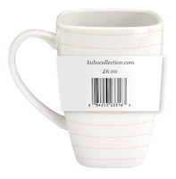
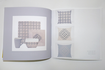
Through this module I have definitely developed my skills in creating a large range or products and applying a constant branded theme throughout. I am really happy with the number of items I have managed to create and how they fit together well as a set. I think I have got better at applying a constant design theme to my work which I think is evident throughout my project. I have also greatly improved my skills at developing a concept, this has been helped a lot by all the workshops we have done towards this. I will definitely continue this into further work as I have found it to be very beneficial. I think the initial research brief helped me to develop my research skill as we had to look into a lot of areas, I think this helped me gain a greater insight into my 'good' and also a better understanding of my target audience.
What approaches to/methods of design production have you developed and how have they informed your design development process?
Creating my research book has helped me dive into designing with a lot clearer idea than I normally have and I think this helped me to work quicker and to a higher, more informed standard. As mentioned before I think that in depth concept development was very beneficial as I had a clear understanding of what I wanted to create and who it was for which allowed me to be more focused and organised when designing.
What strengths can you identify in your work and how have/will you capitalise on these?
I think my strengths throughout this module have been creating a large range of products and relating items that all link together to create an easily recognisable brand and body of work. I am really happy with the look of my items as I think they have a contemporary look that will appeal to the target audience. I also believe creating a range of colour schemes and applying them to my patterns has been successful as it has broadened my range and has made it appeal to a larger group of individuals. I am also very pleased with the range of processes that I have engaged with during this module. I have developed old skills and also learnt entirely new methods like embossing, laser cutting and fabric printing. I really enjoyed learning these as I think it had a big impact on the quality of my work and also the authenticity of it.
What weaknesses can you identify in your work and how will you address these in the future?
Even though I am extremely pleased with the processes I have used I feel something else I could have done was screen printing, to maybe create another sample book. I think due to lack of time and also the length it took me to learn the new processes it was put on the side line. Another skill I could have learnt is binding, the slide binds on the sample books do the job but to improve the overall quality I could have looked into other options to make it look more professional.
Identify five things that you will do differently next time and what do you expect to change from doing these?
- Include screen printing as a process to create another sample book and give more options for the target audience. Even though I have already done it before I think continuing to use it will improve my confidence and the work I get from it.
- Add real life samples to my catalogue, as the printed versions show the visual look but do not highlight the textural aspects that are a key point to them.
- Do more sophisticated binding, from this I would learn a new skill and give a higher quality look to my sample books.
- I would increase the point size of some of the text in my catalogue as some parts are difficult to read because of the thin stroke width and the colour it has been placed on.
- I would annotate research more efficiently so I would not have to it in some more bulk sessions.
How would you grade yourself in the following areas (5 - excellent to 1 - poor):
- Attendance: 5
- Punctuality: 5
- Motivation: 4
- Commitment: 4
- Quantity of work: 4
- Quality of work: 4
- Commitment to the group: 4


