To start this workshop we first looked at how colours react when placed on different surfaces. They are all the same pieces of paper but positioning them in different areas leads them to appear different. For example the middle photo looks the most pink as the grey background is bringing out the blue tones, whereas the far right looks more orange because of the more neutral paper its lying on.
The next two photo's are examples of simultaneous contrast. They show more directly how colour can be altered because of something it's paired with.
We then followed the same process again but added in a brighter tone of our initial colour. It was interesting because previously the other samples looked like an average tone but compared to the new look increasingly dull.
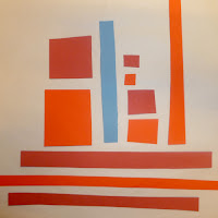
Next an alternate colour was added. I think the blue causes each tone of red to react differently, the darker appears more purple again as the blue tones are brought out. In contrast with the brighter variation which has been intensified because of the contrast. There is also another case of simultaneous contrast where the red crosses from the neutral through the blue.
I then looked at contrast of hue with adding the complimentary colour of red, green. I think this really brings out the colour, especially with the brighter tone.
Here is an experiment with all the samples of colour. I found with this that when the colours are separated it is harder to distinguish the difference. it isn't until the pieces are moved together that it becomes more obvious.
The next experiment was placing the colours or different surfaces, similarly to before. I found that on the neutral the colours appear warmer to the cool look on the white. The colours also look the most vibrant on the black paper.
Here are some further photo's exploring the difference of colour on black or white.
We then found items that represented the light and dark tones of our initial colour. I also gathered a blue object to see how it reacted with the paper.
Here are some type experiments, the aim was to look at how when using text in context the colours you choose can be very important in the impact it has on readability and the alteration of tones that appear. For example the black again makes the colours and especially the white more vibrant. These photo's also show how combing colours that are similar can cause the letter the fade away or become invisible.
This was the final part of the workshop where we combined the whole groups letters and ordered them from brightest to dullest on the black paper. If I was to do this again I would order them slightly differently with the bright red further down and perhaps the blue before the green. We then transferred this to a window to make an installation.


No comments:
Post a Comment