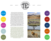
These are the screen shots of my completed website and I am really happy with it. I did a lot more than I expected as there are a great deal of pages involved. I think the layout of the site is very effective as the user can easily move from page to page without having to keep returning to the homepage. I am also pleased with my hover links as I think they link well with my postcards. My shop section was something that I thought I would just mock up but I found that I was able to create it quite easily, the drop down boxes work well and the aesthetic reflects works.


No comments:
Post a Comment