Design for Print Workshop One - Illustrator.
Working with colour:
- CMYK
- printing inks.
- not opaque inks, they mix on the paper.
- different percentages will produce most colours needed when printing.
- subtractive colours, results in absence (almost black).
- process colours, refers to CMYK. Inks used in the commercial print process.
- Illustrator
- Change preferences: plug ins & scratch disks - start up to scratch.
- New document: colour mode - CMYK (print) RGB (screen).
- Best desktop and interface for colour critical work is grey.
- Change colour using fill/line colour picker, colour palette, swatches palette.
- Swatch palette gives consistency.
- There is a default set of swatches although you can set up your own.
- Clear out all existing swatches - drag to bin, use cmd and shift to select multiple. Use swatches menu to select all swatches. Should be left with four: black, white, no fill and registration colour.
- Registration colour is for trim, crop, registration and general printing marks.
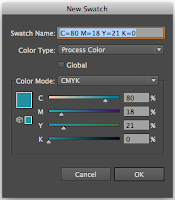
- To add new swatches go to colour palette, set ink percentages and choose a colour. Go to menu and click 'create new swatch'.
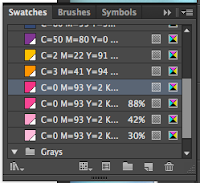
- Go to swatch menu and change to small list view.
- Another way is to have colours already on your art board, go to the swatches menu and click 'add used colours'.
- This means you can get a colour scheme from an existing artwork.
- The swatches added this way look different.
- To change a swatch you can double click it and alter the ink mixture.
- The swatches made using 'add used colours' is a global swatch. Any colour using this will be automatically updated if the swatch is changed. Nothing needs to be selected. A global swatch has a white triangle in the corner.
- Using the colour palette you can alter the tint of a current swatch and then add the new one as another swatch.
- Make sure no items are selected when you do this.
- If the master swatch is edited then the tint swatches will be altered too.

- Comercial print process
- Spot colour - a colour that isn't made of cyan, magenta, yellow or black. It is not processed colour but ready mixed ink.
- They can make things look luminous. e.g fluorescent, metallic.
- Can be significantly cheaper as it reduces the amount of times the stock is passed through the printing press.
- Very similar to screen printing process, with regards to ready made ink. Although screen printing is a lot more work.
- It is a lot more consistent than processed colours and a percent off would create a different tone. Spot colours make it easy for the same colour to printed countless times. Good for corporate logos and packaging.
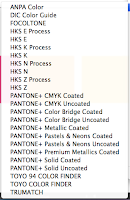
- To select a colour use a spot colour library. e.g pantone.
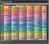
- Each colour will have a specific reference number. So printers know the exact way to mix the ink.
- To access within illustrator go to the swatch palette menu and click 'open a swatch library' then 'colour books'.
- There are different books for alternate stocks.
- You can search specific pantones if you find it in a printed library.
- By clicking on a swatch from the library it automatically gets added to your personal list.
- Tint swatches can also be added from these.
- Copying swatch libraries
- When you open a new document swatches are automatically reset.
- To save a swatch group go to the swatch library and click 'save swatch library as al'. Save in the swatches folder and it will be easily available.
- To access this go to 'open swatch library' and select 'user defined' then click your desired swatch name.
- Another way is to save it in the same place as the work it relates to. This makes it easy to transfer.
- Use the 'save as ASE' option to use in other programmes.


No comments:
Post a Comment