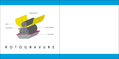
I have now decided to change and re-work my current design them. Although there were aspects that I liked I was finding it hard to be enthusiastic and progress further. The main problem I discovered was the colour scheme, originally I picked it for valid reasons and I liked the appearance of it on the logo and contents page design. But as my designs developed and worked it into my page layouts I found that it looked childish and overbearing. In order to still link with CMYK I have now picked just one of the tones to carry on with, cyan. I think working this in with the tones of grey looks a lot more professional and stylised. I have also tweaked my illustrations from lock colour to linear as I feel it is more cohesive with the new style I am now working with. I am already feeling a lot more positive and I hope this continues throughout the rest of the project.


No comments:
Post a Comment