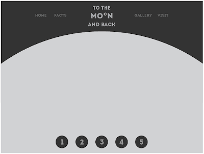
As response from my crit feedback I have decided to re-work my designs again. They have already been through some development but I think the process has been really beneficial to the progress of my work. I have removed my circular frame and replaced it with a semi-circle shape. This still follows the moon theme but I think the content will fit a lot more successfully within this space. I have still incorporated the circles for my gallery and some navigation as it works better in the space than a more angular option. I have also developed my logo design as I think it looks more clean and less distracting.
Scamp
Wire-frame
Digital page mockups


No comments:
Post a Comment