


I then added my imagery into the composition. I played around with size, stroke width and positioning within the composition.


I then finalised the layout by using rulers, guides and grids to get the correct and accurate positioning to give a balanced appearance.


Colour was next to be experimented with, I changed both the text and image to different tones. I feel the type looks less harsh in a more subtle grey and the heart gives more of an appearance of a diamond in the light blue, it also gives a contrast.


Next I repeated both levels and and slightly off-alligned them to give a three dimensional look. I then altered the opacity which I think gives an interesting effect.


Finally I added some lines to the top and bottom of the poster to frame the composition. I have also shown how each piece will be viewed separately as well as when both combined.


With the second poster I started by creating some of the image as how the text is positioned is reliant on how it fits within it. After doing this I experimented with the font being different sizes and placed in different areas.


I then completed the image and finalised where the text was going to be and applied the off alined duplicate of type to match the look of the previous poster.


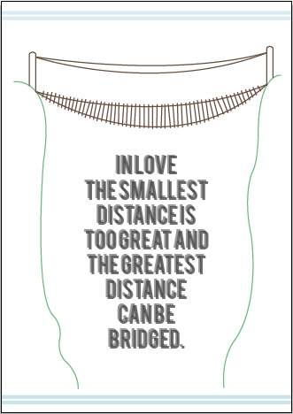


These are the final compositions of this specific poster where you can also see how they would work as a separate piece.


With the final poster I started with the type, immediately aligning it to what I had drew in my initial design and applying the same effect from the previous pieces.


I then inserted my imagery and applied the appropriate colours. After deciding I duplicated it and repeated the off centre positioning.


After changing the colour of the strips I experimented with a few different compositions. Sometimes only altering it subtly to get the most effective appearance.


Here are the final resolutions of this poster, along with the supporting separations.


No comments:
Post a Comment