Thursday 28 February 2013

Type and Grid Workshop Three.

Construction of grids

  • before you can make a grid you must know what you're making it for
  • in industry you will know your stock, size, quality, print methods beforehand
  • thumbnail sketches will make the final design of layout more productive
  • thumbnail sketches should be proportionate to the final outcome
  • before drawing consider the number of columns
  • more columns gives you more scope for design and layout
  • 2 columns could be subdivided into 4
  • 3 columns opportunities for arranging and accommodating text and illustrations in numerous sizes
  • a 3 column grid could be subdivided into a 6 column arrangement
  • disadvantages of 6 column are that the lines of text will be narrow and a small typeface would have to be used
  • for statistics, figures, graphs and trend line publications use 4 columns per page
  • 4 columns can be subdivided into 8, 16 etc
  • the width of a column dictates the size of typeface used
  • the rule, the narrower the column the smaller the typeface

Thumbnails
  • make a variety of thumbnails of layout designs
  • do not just rely on one set of thumbnails
  • enlarge a section of appropriate thumbnail by 1:1
  • compare them and select and repeat process until you are confident with the design
  • it is about generation of ideas

Apply type to columns
  • the first line must fit flush to the top limit of the column grid
  • the last line must stand on the bottom limit
  • it is difficult to find the final solution the first time around
  • it could mean that your grid field is to high or to low
example 1
  • 10pt type - 15pt leading
  • column length 15cm
  • loosely means use 15pt leading
  • at this length there must be 10 lines per field
  • meaning 30 lines every 15cm
  • the depth of my field assertions how many 10pt type lines I have
example 2
  • caption text - 4pt type, 6pt leading
  • header and footer tet - 7pt type, 10pt leading
  • body text - 10pt type, 13pt leading

Type and Picture
  • A4 format
  • 8 & 20 grid fields
  • 8 grid fields are used for advertising material and brochures
  • the grid is only an instrument in which you, a designer, can make interesting and balanced designs
  • 20 field grid has quite a large scope for idea solutions
  • there are 42 possible layout options


Task
  • concertina folds
  • 5 - 16 pages
  • use own work as content
  • challenge the layout
  • use multiple grids

Wednesday 27 February 2013

Batiste Evaluation.

I greatly enjoyed this brief as I think it highlighted a lot of aspects that I am interested in. I think that being personally familiar with the brand helped a great deal as I was more able to understand what was wanted from the client. This has led me to learn that if I am ever unfamiliar with a brand that it is very important to research them in depth as eventually it will really benefit the final designs. On aspect that I feel I could have improved is the web aspect and this is something I need to learn not to forget about in the future. I think my development through this project was good especially with the pattern design and I think this helped the outcomes to be stronger.

Tuesday 26 February 2013

Batiste Website Element.

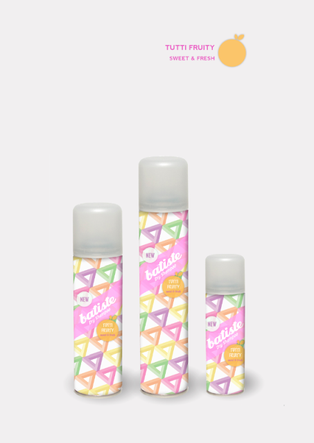
Here is a mock up that I have done to represent how my bottle designs could appear on the current Batiste website. I feel that they fit in very well which I am happy about as my aim was to get my designs to be cohesive with the brands current style.


Batiste Promotional Posters.

Because of the busy designs of my bottles I wanted to make the promotional posters quite simple so that the focus is on the product itself. I also think that having a lot of white space gives a more high end feel, that will help to make the dry shampoo appear as a luxury product. The adding of each fragrances icon has been included so the audience can make a clear link with the product.


What is Good? Re-writing Brief Workshop.

5 words that sum up my good
  1. culture
  2. colour
  3. decorative
  4. architecture
  5. beautiful

5 words that sum up my target audience
  1. cultured
  2. tourists
  3. creative
  4. photographers
  5. architects

5 words that sum up my tone of voice
  1. informative
  2. descriptive
  3. sophisticated
  4. creative
  5. topical

5 products I could create
  1. a publication
  2. posters
  3. packaging for related objects
  4. three dimensional representations
  5. a website/app

5 processes I am interested in using
  1. embossing
  2. debossing
  3. foiling
  4. binding
  5. lasercut

Rewritten Brief

Monday 25 February 2013

Batiste Point of Sale.

I wanted to make my point of sale signs to be individual to each of my bottle designs. I started by drawing out a template to apply my design onto. I really liked the structure of this option as I thought it would really help to make the product stand out. I drew two angles so that when I submitted my work, whoever was viewing would have a clearer idea.


I started by blocking in basic colours and adding my bottles to help the structure come to life. I felt an interesting effect, better than a plain colour would be to add my pattern onto the background. I lowered the opacity so the look was more subtle and would help the bottles stand out. I experimented with the two main colours and felt that the pink worked better aesthetically. I also added a shadow to the bottle to give a three dimensional look.


I then started incorporating other design aspects to advertise the fragrance more clearly. I felt that the berry illustration would be key in getting across the feel of the product so I experimented with it a lot in different sizes and sequences. After deciding that this would be a focal point I altered the pink to grey as it made the berry a lot more prominent and the neutral colour made it seem more vibrant. I also experimented with type using the font from the bottle and the Batiste logo and I soon came to realise that with multiple images and the text the composition became to busy and detracted from the bottles. I then stripped back the design to one shape and the batiste logo. I felt the scent text was unnecessary because the berry could get across that point on its own.


I am very happy with this final outcome as I think it successfully highlights the product. After finishing this design I applied it to the other angle where it works just as well. I then moved on to the fragrances using this one as a template so they all still worked as a set.


What is Good? Concept Boards.


Feedback


Friday 22 February 2013

What is Good? Format Workshop.

Five things I don't know about the formats

  • blizzard bind - the exact folding process
  • concertina bind - whether it is better to secure the pages in the mountains or valleys
  • accordion bind - how long will the stock need to be to get an appropriate amount of pages
  • japanese bind - what is the best thread to use
  • screw bind - where to buy the screws themselves


Five things I don't know about processes

  • laser cutting - how do you work the programme
  • laser cutting - how do you just indent the surface rather than cutting all the way through
  • embossing - what is the best stock to use
  • embossing - how damp does the stock need to be
  • embossing - what material is the best to create the stamp to emboss with


Reasons why favourite example (blizzard bind) is bad

  • the stock that would be needed to be used would be very long
  • it might not be very strong
  • it could deconstruct easily
  • the process seems very complicated


Reasons why favourite example (blizzard bind) is good

  • very unique and original
  • pages slot in easily
  • content can be changed and rearranged

Thursday 21 February 2013

Parfumeur Progress Meeting.

Products:
  • Packaging and Range
  • Range Name
  • Perfume Dispense [ Packaging and Materials]
  • Pack
  • Name
  • Bottle and Pack design
  • Moodboards


Initials Ideas:
  • Wooden box
  • Exterior cardboard with colour
  • Can be laser cut
  • Wooden box can show through
  • Create some texture on the wooden box
  • Base more on the colour
  • Abstract Pattern
  • Abstract Colours
  • Colours will be representing each of the fragrance
  • Box will be cube
  • Perfume bottle will be laying flat down, display the whole bottle
  • Promotional stands

Type and Grid Workshop Two.


Parfumeur Progress Meeting.

Initial Ideas
  • wooden box
  • exterior cardboard with colour
  • laser cut cardboard so wood shows through
  • wooden box can also be laser cut with additional designs
  • wooden box a smooth cube with a modern look
  • perfume bottle lay flat inside the box
  • promotional stands

Project Rationale


Rewritten Brief


Tuesday 19 February 2013

What is Good? Binding Task.

I have chosen to look into binding techniques as I am interested in creating a publication for this project. I have looked into more traditional methods and also more contemporary ideas. I have also looked at ways where I may be able to do the binding myself, rather than having to get it done by a professional.


Blizzard book

The blizzard book is a structure devised by the american book artist Hedi Kyle. It's a multi-pocket structure made of one piece of paper, folded, very much like an origami. These next images show the different steps in the folding of a very narrow one, designed to host double pages, thus forming a kind of album. The marvellous world of folding.


Stock: japanese paper, tyvek, any paper which takes a good fold

Cost: cheap, only cost of paper

Process:


How it could be reproduced: with large sheets of paper within the studio

Time: probably a long time because I don't have skills in this area


Concertina book

The pages and the cover of this album are made out of the same black cartridge paper. The cover is made in (almost) a single piece of paper. Process diagrams show sections sewn into the valleys and the mountains.


Stock: cartridge paper

Cost: cheap, cost of paper

Process:


How it could be reproduced: With paper in the studio, and also a needle and thread

Time: a long time because I don't have the skills


Accordion book


Stock: two pieces of mount board, one long piece of landscape paper

Cost: cheap, just coast of paper and mount board

Process: fold the long piece of paper in a concertina style so the folds are equal, stick the two pieces of mount board on either end

How it could be reproduced: with paper and mount board in the studio

Time: pretty fast because it seems a simple process


Japanese stab binding

This technique is ideal for binding single sheets of paper in soft covers and can be used for diaries, class notes, phone messages, recipes, and school or business reports.


Stock: most types of papers-handmade, commercial or tracing papers, even acetate can be used for Japanese stab binding. If the book will contain writing, the paper must be smooth. Inexpensive photocopy paper is also fine for text pages, and has the added benefit of being readily available and cut to a standard size. Although the cover for this binding is always soft, it can be single sheets of heavy card-weight paper, single sheets with a turned-in flap, or sheets doubled over. The cover also can be one piece that wraps around the spine to give the pages more protection. 

Cost: cheap, price of stock and thread

Process:


How it could be reproduced: I think I could do a lot of this process on my own although I would need help it punching the holes. If I was to practice this in the studio I could try a thinner option and just use a whole punch.

Time: I think this process could take a while as it is something I have never done before


Binding screws


Used for binding loose sheets, pillar and post screws are used to secure the printed document. Commonly used for product swatches, photo albums, bespoke brochures etc. Binding Screws are a print finishing process (after printing).


Stock: page sheets and cover

Cost: cost of stock and screws

Process: The pages are gathered in order, drilled, and the pillars and posts are inserted until they meet - they are secure by screwing the pillar and post together.

How it could be reproduced: I think this is a process that I definitely couldn't do on my own within the studio

Time: I think this will be quite a long process.