Tuesday 31 January 2012

Type And Grid Magazine Layouts.

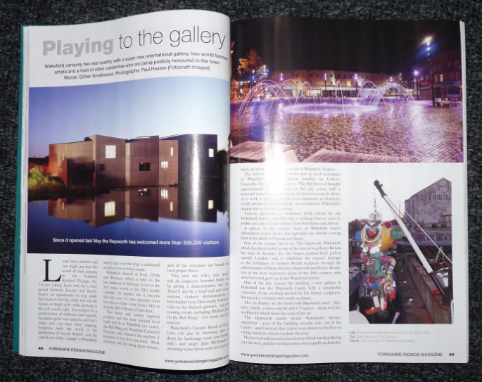
Here is the magazine spread that I have decided to re-design from '...' I chose it because it has a good selection of type hierarchies and imagery.

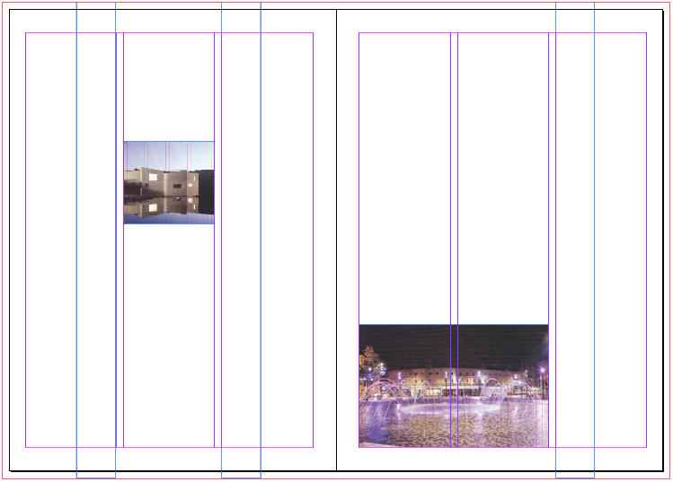
I then drew on the magazine to decide my grid and translated onto InDesign.

I then used a minimised version of my grid to design some alternate layouts by using the aspects of the original piece. To start with I thought it would be difficult to create so many variations but as I got going ideas flowed easier than I thought.

Here is the chosen design I have decided to recreate. I have chosen this because I feel the linear style will work well and look effective.

I then moved on to creating my chosen thumbnail on InDesign, I started by creating my grid and adding boxes to represent the main aspects of the composition.

Next I scanned in the original images from the magazine and placed them into the boxes I had previously made. I then added the coloured boxes that I had drawn in my design, although I soon found  that the colour I had chose to start with didn't fit as well with the photographs so I changed them to a bluey grey.

I then experimented with type. I soon found out that picking one that would work would be harder than I expected as the handwritten style I had originally drawn did not fit into the chosen area when I used a typeface. So I decided on a simplistic sans serif option that I think fits better with the style of the spread. I also altered the colours further to create a more balanced look.

This is my final composition and I am happy with it. Although some aesthetic options have been changed around the main layout has remained the same from my design and looks effective.

Monday 30 January 2012

Final Zines.

I have finally finished all of my zines I am pleased with the end results. The first one I made took the longest but after that I found the others flowed faster because I already had a base design. I think the front covers look good together and I would like to carry on a similar consistency with my postcards. The biggest challenge I faced was creating the imagery as I find Illustrator the hardest programme to use, I found that as I made my way through doing so became easier which I think will be beneficial for further work. I really enjoyed laying out my information and creating a balanced composition, for this project I was using InDesign for the first time. I found the workshop we did for it very helpful as I felt quite confident going into it for these. I am glad I had that experience before I started my zines as I probably would have used another programme that would have made the process more difficult and less successful. I am happy with the overall appearance of these pieces as I think they fit the notebook appearance I was going for. I enjoyed scanning in different samples of paper and tape and I think they work well in adding interest and highlighting aspects of my layout.


Crit Feedback.

During this crit we had to fill out a form commenting on someone else's work and then on our own. Here are the sheets filled out by Greg and myself.

After reading through this feedback I am happy that he likes the concept and thinks it will appeal to the audience as this is something that I have tried hard to achieve. It is also mentioned about the size of the zines, which is something I have considered myself so I might experiment with alternate layout options to be sure that I have the right format.
Filling out my own form was a good opportunity to really reflect on what I had done so far. Something that came up was that I could improve my design sheets, which is something that I struggle with when it comes to transferring what is in my head to paper.

Zine Construction.

Creating my zines was a very slow process as there were so many aspects to consider. It was also my first attempt at using InDesign so setting out my document in the beginning took a while.
I started by creating my front page and choosing a texture from a website to apply to the surface. I experimented with a few different ones and also over laying colour to create a brighter appearance.
Type was the next area of experimentation, I looked at a selection all of a handwritten style to fit with my notebook theme. My favourites were Mari&David because of it's narrow appearance in capital letters and ActionJackson with it's 3D effect. Some I found that when I converted them to white they became illegible.
After deciding my chosen typefaces I experimented with layout and colour. I think the darker burnt orange works well and compliments the background well. 
Next I drew some lines to help frame the composition. I used the grid to ensure everything was central and in line. I also looked at opacity so that they didn't overpower the type.
I then moved onto adding the imagery I had created. I continued to use the grid and explored different sizes, positions and opacities before settling with the final look.
The last aspect of the front cover was the sample of tape, which I think really finishes off the design and assists they eye in travelling across the composition.
Next I furthered the process to my inside pages where I decided on a lighter background and started inserting and experimented with my wording for the introduction page. I decided on just using one of the typefaces as I thought that with the larger amount of words using the both was too overpowering and I couldn't find a good balance. I looked at different colours and using colour to highlight important pieces of information from the text to draw the readers attention.
I then added in my imagery, because of the loss of quality in the editing stages of InDesign it's quite off putting when you look at them because I worried about how they would print but it's just something I got used to through the process. One thing I looked at was adding a text wrap to make the text not overlap with the picture, this was a very useful and time consuming action. Opacity was something I altered again to ensure it wasn't overpowering.
Finally I added the lines like the ones on the cover to create constancy and to define the edges of the composition.
Next to do was the main content page of the publication. I went through similar processes to create this, of using the grid to align the different aspects. It was quite tricky laying out all of the information because there was so much of it to include but when I found balance by weighting the page and considering font size and colour, imagery and added aspects.
I then carried on with my final page. I decided to keep one of the sides blank so it mirrored the first page.