Showing posts with label 100 Things. Show all posts
Showing posts with label 100 Things. Show all posts
Wednesday, 8 February 2012
Tuesday, 7 February 2012
Final Crit Feedback.
Here is the feedback I received on the final crit from Sam and Sam. I am really happy with it as they right how they feel my piece is relevant for my target audience in the style I have chose. One development they suggested was to vary my imagery, this is something that I could work on for further pieces.
Final 100 Things Photos.
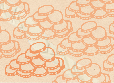
Here are some final images of my final pieces! I am really with how they have printed out apart from one small problem of one of the zines being slightly smaller than the other three. Annoyingly I didn't notice the fault until I started cutting out the paper a few days after printing and with problems in the print room I was unable to get a space because I hadn't booked a print slot. Even though it is still visible how my pieces work as a set and I think the consistency works well. To begin with I was nervous about the double sided printing incase it was really out of line, but it was all fine. I think my favourite pair is the 'students and finance' because I really like the contrast between pastel and burnt orange and I think the repeat pattern of the imagery looks attractive. From seeing all my pieces in a group I am happy with my colour scheme as I think each tone compliments well.
Thursday, 2 February 2012
Group Crit Feedback.
Today we had a group crit where lots of statements were made about all the work that was displayed. Here is what was said.
- Unclear of audience
- Context
- Where/what/why?
- Interesting concept
- Is it what it says it is?
- Visually consistant
- Audience
- Are you being inventive enough?
- How would you justify what you produced?
- How the eye travels
- What reaction are you expecting?
- Repetitive
- Doing things for the sake of it
I didn't find this crit as useful as I have some others mainly because there isn't much clarity. For example, with my work it is hard to tell whether it is thought to be visually consistent in a good way or repetitive?
Wednesday, 1 February 2012
Final Postcards.
These are my final postcards I am really pleased with how they have turned out. I think the repeat pattern looks effective and the colour schemes of each work successfully together. I am also happy with how they are consistent with the zines and look good as a complete set. I was quite surprised that all the images worked well as a pattern, a few needed a couple of attempts to get a aesthetically pleasing and I think the darker one in them all finishes them off well.
Post Card Creation.
Constructing my postcards was a lot easier than my zines, for the obvious example of size, amount of contact and the fact that I already had the imagery and design style to work with. I started by choosing my main image from each piece that I thought summed up the overall theme.
The hardest part of this construction was drawing out the grid to fit the maximum number of images into the composition in a balanced way. I divided up the space equally in order to achieve this.
I then started to arrange the images within the grid and duplicating them to fit the pattern. I did a lot of readjusting so that they lined up perfectly to create a uniform look.
After I had placed a fair few I started rotating the pieces to create the pattern, these had to placed differently than the others in order for them to appear correct.
After completing the whole grid I experimented with the opacity as I think the pure colour is too powerful and overpowering. I looked at a few different levels to see what would work best.
I then added the background to my piece which was the same as the cover of my corresponding zine. I chose to do this to keep consistency between the two.
Afterwards I added a sample of some torn paper to add another level to the composition. I experimented with moving it around to find the best positioning.
I finally looked at creating a focal point in the piece by upping the opacity on one of the images. I think this works really well and finishes off the postcard successfully.
I then moved on to the reverse side of the postcard carrying on with using the backgrounds from the original zine, although on this one I used the colour from the inside pages.
When I got the correct colour I then inserted the lines that I used on the edges of my pages around the outside of the box to create a frame.
Subscribe to:
Posts (Atom)


