Sunday 31 March 2013

UK Greetings Initial Illustrations.

As an initial idea I have chosen to develop the idea of cards 'from the dog', it is an area that I have seen before but it is still very untapped. I feel that my designs could help push this area and make it into a more mainstream range. I picked dogs that I felt had character and also linked with the quirky feel of my idea. I really enjoyed drawing them as illustration has been something that I haven't focussed on as greatly during this module and it was great to get back into it. I started with just linear designs but I felt that colour needed to be introduced to make the illustrations seem more life like and therefore give a more loveable feel.


UK Greetings Possible Themes.

I have made a list of possible avenues and occasions I could go down when creating my greetings cards. Because there is so much competition within this field I wanted to pick an area that was more uncommon as I felt it would help my designs to stand out. This is why I have decided to look into 'cards from the dog', this was backed up by the fact that the number of dog owners has increased significantly and dogs have now been revealed to be the UK's new favourite pet, overtaking cats for the top spot. I think that because I have chosen such a unique card topic my designs need to reflect this and have a quirky appearance.
  • Happy Birthday
  • Christmas
  • Easter
  • Anniversary
  • Wedding
  • Baby
  • Christening
  • Valentines
  • Mother's Day
  • Father's Day
  • Congratulations
  • Thank You
  • Sympathy
  • Get Well Soon
  • Retirement
  • New Job
  • From The Dog
  • Halloween
  • New House
  • Good Luck
  • Age Cards

UK Greetings Idea Generation.


UK Greetings Brief.

Saturday 30 March 2013

Chocolate Packaging Designs.

The requirements for this brief have been very specific. Initially the first point that jumped out to me was the the clients interest in the japanese style. After researching this I found that a style of pattern that appeared a lot was this circular one, I also liked it and I thought it would be successful repeated and a variety of colours could be applied to it, another aspect that the client stated.


I decided on the pink option for my design as I felt is was appropriate for confectionary and also had a feel of luxury and quality, but for the range other colours could be used. The next step was to create a window for the product to be visible through. I started with a rectangle but I felt it looked to much like standard packaging. I then developed this to the circle as I felt it worked more cohesively with the pattern and was also more creative and interesting.


Another aspect the client stated to include was an 's' on a dark background. I decide to follow the circular theme by placing the letter inside one. I experimented with different typefaces to see what I felt worked the best. I wanted quite a contemporary look so I felt the serif option didn't fit the style I was looking for. Some options were also to bold and decorative that seemed to compete with the pattern.


I decided on the narrow, sans serif font as it complimented the rest of the design the best and I altered the size of the circle so that it fit more cohesively into the pattern and layout. I then added the allocated text, this wouldn't have been my choice but it has been stated that it needed to be included.


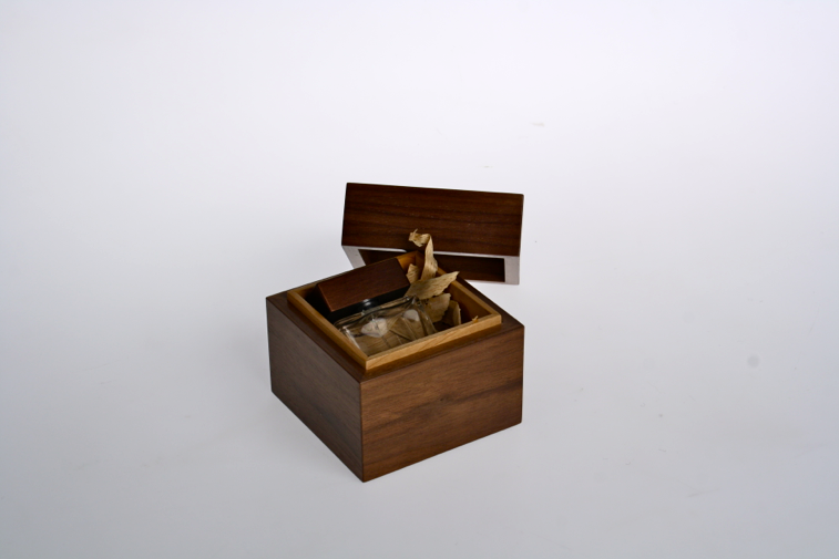
I finally worked on making my design into a three dimensional shape that reflected what the client wanted. I am really happy with how his went as I feel the end result looks realistic and professional. I feel that the window looks really effective and demonstrates how the package would look with and without the product inside.


I then moved on to to make the other two packages following the design choices I has made previously. I found the composition these a lot harder to complete as there was less space to use. Again I am happy with the mock ups as I feel that again the look realistic and help to put the design across in the best light.


Wednesday 27 March 2013

Chocolate Packaging Brief.

Job Type
Packaging Design

Task Outline
Create a Packaging Design

Task Description 
Our requirement for this task is the packaging design for three types of packaging.
We are looking for a consistent theme through-out the three packaging types, and with-in each package type, there should be 6 colour variations.
This range is to be:
  • FUNKY
  • MODERN
  • very much suited to the Asian (japanese style) market.
  • FUN is very important.

Design Elements
Creation of a small 'S' inside a dark background box - this is to be used on everything.
This is BASE PACKAGING design, we will add stickers to show flavours, nutritional panels, etc, as these change often.
Six colour variations for each package type please, but with the same design elements/graphics on each.

Package Type One:
Stand up Pouch Height: 160 - 170mm Width: 100mm Depth at Base: 55mm
Package should have a window near the bottom (say 25mm from bottom or so) to show product.
For the purpose of showing your design, pick one colour and include the following information:

Product Type: TREAT BAG
Product Description: Yummy Dark Almonds
Blurb: Too good to share!

Package Type Two:
Cube Height: 80mm Width: 80mm Depth: 80mm
We are interested in some interesting ways of presenting the cube (we prefer a base with the fully enclosed lid, can provide pictures) and you can apply a die-cut shape to the side of the lid to create contrast (eg, dark base, bright lid)
For the purpose of showing your total design, please include the following information which will appear on stickers:

Product Type: TRUFFLES
Product Name: Almond & Honey
Blurb: It's hip to be square!

Package Type Three:
Tablet Length: 60mm Depth: 80mm Height: 10mm
Open to ideas as to how the box could work, but keep in mind simplicity to help keep production costs down.
A foiled tablet will be inside each tablet box, but we could have a small window and keep the bar inside wrapped in clear before going into the box.
For the purpose of showcasing your design, please include the following information:

Product Type: TABLET
Product Name: Caramel
Blurb: Happiness awaits!

This is only the beginning of the new range we are planning - we have been established for over 4 years now and this range is to modernise our offering. We anticipate quite a bit of future work around stickers/labeling/hang tags/ etc that are all consistent with the base design elements you develop.

Deadline
Saturday, April 06, 2013

Target Market(s)
Females aged 15 - 45, but centred around the 18 - 29 age group.

Thursday 14 March 2013

Parfumeur Photoshoot.

For this brief it was important that me and Tani took some high quality photographs to use for our submission boards. Because of this we took advantage of the photography studio rather than just using a temporary set up. We booked out some lights and asked the technician to help us set them up as it was something we felt we wouldn't be able to do correctly ourselves.


We used the manual settings on the camera so it took a few attempts to get the settings right as they were often under or over exposed. Although with the workshops we had taken part in previously with photography we felt we were able to correct them quite quickly.


After the settings had been finalised we then started experimenting with placing our objects within the composition, using the light and shadow to highlight different areas of the form. We tried the objects in a number of positions in order to get a good variety that would be interesting to look at.


I feel that these images of the plastic sleeves are really interesting as with their transparent appearance how areas show through is quite strange, how the lights shines onto them adds to this effect. I especially like how when multiple ones are in the frame the colours mix together and how the forms interact create the look of an optical illusion.


Finally we experimented with macro shots to highlight the detail of our work. I think these have worked well as it gives another viewpoint for the audience to look at and also highlights the craftsmanship that has gone into it. I also like how with the close up hots it is easier to see the wood showing through the sleeves and it adds a lot of texture and interest.