Saturday 31 March 2012

Stamp It Cover Correction.

I recently realised that I made quite a major mistake on my original cover as it stated '6x1st' when there was actually only four stamps inside. I have now amended it.

Stamp It First Day Cover.

This is the design for my first cover. To begin with I struggled with what it actually was but after researching it further it became clearer. I have included imagery of all my stamps, a title and also a postal mark with a date of release. I am happy with it as I feel it fits well with the rest of my designs for this brief.

Monday 26 March 2012

Blog Evaluation.

Alphabet Soup - Condense.
This was the first main brief that we did. The theme was quite basic but it allowed us to really focus on the concept in a direct way. My word was condense, to begin with I found it easy to find ideas to apply but as I got further through it got more challenging. Although I found that the ideas I came up with later were perhaps more successful than the originals. My research for this wasn't very specific because of the number of variations we had to create. As well as this I also looked into current typefaces that I could base my new design on that would accommodate my designs. I feel the most successful of the set are the condensation drops, bubbles and drips.
Alphabet Soup - Partner.
This is one of the briefs that I found I connected with and I really liked my end piece. Initially I found it difficult to apply the answers from the questionnaire to a typeface, although once I had decided on my compass idea and started experimenting with it I found it fitted into place. I found the most challenging part of this project was finding a suitable original typeface to use that fitted with the grid I had made. When I had finally completed it the time consuming part was transferring it by hand onto tracing paper especially with all the dotted lines.
Proverbally Yours - 3 posters.
Next up was proverbally yours where we were given a proverb from the randomiser, I got 'Absence makes the heart grow fonder' which I was really happy with as it was one that I was familiar with and I thought I could produce some nice imagery to go with it. The research I did for this was very limited and could definitely be improved on, I think if this was done it would also improve the overall look of the posters too. I feel I did a good amount of layout experiments for the posters which ensured I chose the right option.
Proverbally Yours - Mail Shot.
Linking to the last brief we then had to create a mail shot, but with an added aspect of having to refer to a certain occupation. I had a rapper which turned out to be really difficult to link with my original proverb. Originally I had the thought of creating a cd consisting of rap songs associated with love, but after thinking about it I moved on to the links with that style of music and gang and violence culture. I liked this idea but I don't love my final piece as I find it isn't a style that I am aesthetically attracted to. I think the tattoo aspect fits well with my album cover research and the type style also links with my original poster design.
How To - Group.
This group started off individually with a how to question, we then got combined into larger groups of people with similar themes. After getting together we decided on the idea of how to grow vegetables. As a group we did a fair bit of research into this such as questionnaires, imagery and audience related. We found that when we went into our crit our idea changed quite a lot as it was brought up that it could cater to our student audience more. This put quite a bit of pressure on the group which was difficult and I got pretty stressed out right at the end and was relieved when it was over.
How To - Individual.
This was our main research orientated brief. It went on for a long time which allowed for a big body of work to be created. I found gathering the 3 sets of 100 really useful for when it came to collating my final piece. To begin with I was concerned that I wouldn't be able to create all 5 zines as it was a lot of work, although I found that once I had created one I found that the others came easier as I already had a template to work with.
The Poster Brief.
This was the first live brief we have been given and it was interesting reading a brief in a new format. I really enjoyed creating the imagery for this as I felt there was lots of avenues I could go down and I developed a style I hadn't used before. I did a lot of experiments for this which has been documented thoroughly on my blog. I didn't change a lot after my final crit except to alter some words and some colour tones.
Communication Is A Virus.
This was another group brief that I did with my 3 closest friends on the course. Initially we were slightly worried about the situation as we were unsure how we would work together in a group but afterwards e found that we worked successfully together, got a lot done and created some successful end results. We all had quite specific jobs to do within the project which worked well, this also helped when were presenting as we all knew what to say in each section. One thing I am proud of that we did during this was getting our product out into the environment via the local cafe's as we successfully pitched our idea the business owners and created our products on time to be used.
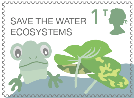
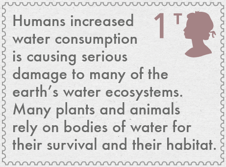
Stamp It.
I really liked the pieces I made during this brief and I really felt I explored a different style. After drawing my illustrations I had quite a strong idea on what I wanted them to look like so I was happy when I achieved it. The main challenge of this brief was condensing my ideas onto a small surface area and still conveying the intended message. After completing my stamps I am going to have to alter them slightly to focus on a different idea that was suggested in the crit.

Friday 23 March 2012

Stamp It Final Photos.

Here are my collection of photos of my final Stamp It products. I was happy with the quality of printing and I think they look good together. I think a professional finish has been achieved that would work well in a real life environment.

Tuesday 20 March 2012

Stamp It Poster Design.

I have now started experimenting with my poster designs and compositions. I was very clear on what I wanted to be included so it was just a matter of organising the aspects into the layout. I trialled a few different options but I feel the last is the most successful as I feel it separates each part the best to give the clearest view of the information. I also like how the theme mirrors the stamps so they fit in comfortably.

Stamp It Final Designs.

Here are my final designs and cover ideas. I am really proud of them as I feel I have pushed myself to create them. I like how the designs have clearly developed from my initial drawings that I did by hand. I also feel the environments work well with the creatures to add another level to the composition, this was something I nearly didn't do but I am glad that I persevered with it. Also although each stamp has a different theme of colour each one compliments the rest to give an aesthetically pleasing set. My favourite would have to be the frog as I think with the additional lily pads he has a lot of character. My least favourite is the 'fading away' piece as although I feel it is necessary to link the stamps together and give the message is the less exciting and attractive of the group.

With my cover booklet and I like how all of the animals have been incorporated into the composition together so they can all be viewed. I also think it gives a sense of unity between the characters in their fight against saving their habitat. A short description has also been added to give the audience a further insight into the cause.

Stamp It Cover Designs.

I have now started the process of designing my cover for my stamp collection. I initially started with the basic layout which included incorporating my three characters and the number and class of stamp inside. I then set about creating and environment for them similarly to how I did with my stamps and then arranged the animals within that to give a more dynamic composition. Next I added more content to fill the layout and relate the cover even more with the stamps and also experimented with different colour type options.

I am really happy with this final design, I have altered the opacity slightly from before on the backdrop to make it more subtle and allow the characters to stand out further. I like how they extend past the edges of the border which will allow the design to continue across the the other side.

This is the back of the cover, which I started by filling some of the empty space which had to be altered in order to fit in the necessary information. Like the type on the title and text which I experimented with to get the right balance in the layout. When selecting the text I had a big piece to choose from so I tried to select the most important point to share.

This is the final outcome which I I kept more simple than the front in order for the focus to be on the information so that it doesn't get missed between a lot of imagery.

Monday 19 March 2012

Stamp It Layout Experiments.

This is the part of the process of transferring my illustrations into a composition. I found this difficult because of the small surface area and fitting everything necessary into it. I started by using a textured, brown background but I felt that however much I altered the layers the image didn't stand out as much as I wanted it to. I then started from scratch with a white background and I feel this looks a lot better.

After adding some text I felt the composition looked to empty which is when I started to create an environment for my frog to sit in. I spent a while experimenting where everything would sit and creating space for the type to be visible

After completing my composition I added a different textured background, I think this one works a lot better as it dims the contrast between the two levels and makes the transition from foreground to background more subtle.

Finally I altered my typeface to Futura with I think works better with the appearance.

Moving onto my next character I continued with the style I had decided on previously, I created a new environment and arranged the aspects to fit accordingly. The colours have been altered slightly but I have consciously kept them in similar tones so that they still work well together. The background texture has also been kept the same to help with the continuity.

This is my fish design where I did a lot of colour experiments in order to find the most suitable choice. I have continued the use of water but through the layout have portrayed its depth which I think is interesting as it gives some variation from the other compositions.

Finally I made this final stamp which I wanted to portray a message. I started by using a large body of text that filled the space, although on its own I didn't think looked very aesthetically pleasing. Because of this I then started incorporating factors from the environment to create a backdrop and then lowered the opacity to give the impression of it fading away. I then attempted to incorporate the writing again and found it still didn't give the look I was going for, this is why I simplified the type and planned to give a bigger explanation on the packaging and poster.