This is the part of the process of transferring my illustrations into a composition. I found this difficult because of the small surface area and fitting everything necessary into it. I started by using a textured, brown background but I felt that however much I altered the layers the image didn't stand out as much as I wanted it to. I then started from scratch with a white background and I feel this looks a lot better.


After adding some text I felt the composition looked to empty which is when I started to create an environment for my frog to sit in. I spent a while experimenting where everything would sit and creating space for the type to be visible


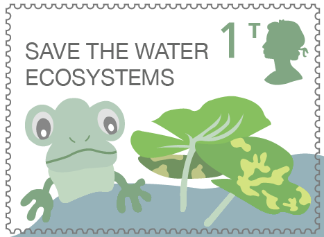

After completing my composition I added a different textured background, I think this one works a lot better as it dims the contrast between the two levels and makes the transition from foreground to background more subtle.


Finally I altered my typeface to Futura with I think works better with the appearance.

Moving onto my next character I continued with the style I had decided on previously, I created a new environment and arranged the aspects to fit accordingly. The colours have been altered slightly but I have consciously kept them in similar tones so that they still work well together. The background texture has also been kept the same to help with the continuity.


This is my fish design where I did a lot of colour experiments in order to find the most suitable choice. I have continued the use of water but through the layout have portrayed its depth which I think is interesting as it gives some variation from the other compositions.


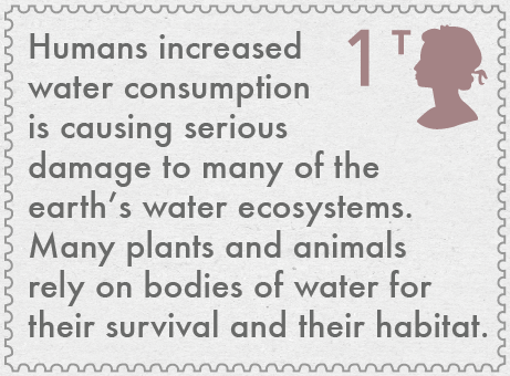
Finally I made this final stamp which I wanted to portray a message. I started by using a large body of text that filled the space, although on its own I didn't think looked very aesthetically pleasing. Because of this I then started incorporating factors from the environment to create a backdrop and then lowered the opacity to give the impression of it fading away. I then attempted to incorporate the writing again and found it still didn't give the look I was going for, this is why I simplified the type and planned to give a bigger explanation on the packaging and poster.


No comments:
Post a Comment