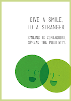
These are some poster designs that I have been putting together. I started quite simply by just using the original logo and campaign title. I also added a caption to help put it in context. Although I like how this design is quite to the point I think it can be pushed further.
I have now moved on the design by experimenting with the layout and the elements within the composition. I like the non horizontal text, I think I may try some other ideas like this.
I like how this arrangement exaggerates the circular shape of the logo without being distracting.
Here are my experimentations with lower opacity and incorporating the website logo.
I have now recreated the logo myself using Illustrator. It now matches better with the colour scheme and Beth's illustration style that we have already used.
Finally I added this scannable barcode instead of a web address. I think it makes the design more current and accessible to the audience.


No comments:
Post a Comment