Showing posts with label Crits. Show all posts

Wednesday, 6 February 2013

Responsive Final Crit.

I feel that this type was very useful as I got lots of individual points of view. I am happy that the gender audience for the design has now been cleared up and that people have responded saying how appropriate it is for the audience. My mock ups have also been taken well, which is good as I spent a long time ensuring they had a clean and professional look. It has been suggested a few times that I experiment with different colours so I think this is something I will look into.


My Feedback:
  • Designed for the selected target audience very well
  • Research into existing work is highly effective: Concept for freedom/birds is very effective
  • Could possibly experiment further, maybe different variations of colour/different patterns
  • Possibly show how designs could be displayed in context

  • Covered lots of different products, shows that the pattern can be applied to a variation of shapes
  • Can tell who the target audience is with the design and also the products chosen
  • Looked into successful pattern product design
  • Thought about stock and how pattern is applied
  • Clear design sheets
  • Maybe look into colour, see how the pattern would differ
  • Products in context, against other ranges that PC world offer

  • Very suitable for its purpose
  • Good design process for submission, maybe add context pics of the iPhone cases in use
  • Could number your boards
  • Presentation boards covered all areas that need to be discussed 

  • Maybe discuss how your approach began after your research
  • Beautiful illustrations, appeals to your audience very well
  • The overall collection is fantastic, complimentary and consistent throughout the collection
  • The brand still stood out very well against its background, effective
  • Maybe consider your context

  • The mock ups look really professional, I like the vector illustrations
  • Experiment with different patterns
  • Good colour scheme colours work well together

Thursday, 17 January 2013

Responsive Interim Crit.

I found that for this crit I had a greater amount of work than most people because of my earlier submission date. I am really glad that I had this shorter deadline because it pushed me to get this brief finished and out of the way. I think because all of my work had been done I got some good in depth feedback. I was happy with what I received, the only bit of confusion was with the gender of the target audience, as the people critting thought it was for male and female when in fact it was just for women. This is something I will make sure is clear for the final crit.


My Feedback:


Group Feedback:
  • Has the potential product range been fully exploited?
  • Has the content of delivery been considered?
  • Has the audience or gender been considered?
  • How much information is needed?
  • Clarity of presentation and organisation?

Action Plan:
  • Further mock-ups

Thursday, 10 January 2013

ISTD Progress Crit.

Feedback:

  • Postcards are relevant and the small amount of information on them isn't a problem as it is being used as a promotional tool for the website.
  • Postcards could be decorative as there is no need for them to be robust.
  • Additional promotional material could be created to bulk up the print side of the project.
  • Packs could be created for the individual travel experiences and could include items relevant to that type of trip. It could also have things like travel tags, passport covers and stickers.
  • Could create simplified maps for easy viewing.
  • Third web design is the most successful as the navigation is the easiest.
  • Colour coding for different holidays works well.

Tuesday, 11 December 2012

ISTD Interim Crit.

My Feedback:


Action Plan:
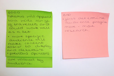
  • re-consider/clarify audience
  • clarify ten topics
  • more design research
  • do some design work
  • have majority ready for next interim crit

Wednesday, 5 December 2012

ISTD Concept Crit.

Rewritten brief:


Feedback:


Five things I still don't know about my content:

  1. previous holiday goers opinions on different holiday experiences
  2. what ten holiday topics I will focus on
  3. further details about different holiday types
  4. cheapest and most expensive holiday options
  5. possible imagery I could use to illustrate my topics

Five ways my audience could come in contact with my work:
  1. travel agents - handouts/posters
  2. airports/coach stations/train stations
  3. online travel guide websites
  4. gift shops
  5. within travel brochures

Five new problems:
  1. what should I narrow down my audience to?
  2. how shall I gather opinions?
  3. what formats will work best?
  4. what style of imagery should I use?
  5. what holiday topics shall I focus on?

Five reasons they need to be solved:
  1. so I can be more specific in my design choices and create more successful products
  2. so I can have a primary research aspect to my projects and it will benefit my audience
  3. so I can target and interest my audience in the best way
  4. so I can illustrate my information in an engaging yet clear outcome
  5. so I can cover a broad range of topics and cover my audiences interests

Tuesday, 27 November 2012

Design for Web Final Crit.

My Feedback:


I found this feedback very helpful as I already, personally wasn't 100% convinced with these designs. Especially with the circular layout and fitting the content inside of this whilst still keeping a consistant and visually pleasing look. I have decided to stick with a circular idea as it has been taken well and links strongly with my theme, although I think I will develop it so that the content fits better and there isn't such a strong contrast with the square and round edges. I will also experiment with using different type, as it has been said that what I have now isn't necessarily relevant to my topic. I was quite surprised when one group didn't write any areas of improvement as I could name a few myself. I think it would have been more helpful to me if they had done so, even if it is quite flattering to see.


Action plan:

  • experiment with different type - make more relevant to my topic
  • develop layout - fit better with content, new scamp and wire frame


Common group feedback:

  • simplify navigation - homepage to home etc.
  • content - to much information, to long... didn't read it
  • consistency of layout
  • clarity
  • complacent feedback, be more specific

Wednesday, 21 November 2012

Design for Print Final Crit.

My feedback:

I was extremely happy with the feedback that I got today as it was really positive and also gave some really relevant improvements. Seeing how stressed I was not long ago about not liking my designs and changing the look to what I have now, it is reassuring to hear that it was the right choice. One thing that I hadn't considered was changing my front cover design but after reading my feedback this is something I am definitely going to do. I hadn't noticed before that it doesn't fit with the aesthetic of the rest of the publication, but it is now really obvious. I will also experiment with ways of distinguishing my chapters as this is also something that has came up.


Action plan:
  • re-design front cover to be more consistent with the rest of the publication
  • experiment with different coloured chapters and other ways to distinguish them
  • look at page numbers
  • check 'widows'

Common group feedback:
  • good research
  • contents pages
  • page numbers
  • basic type skills - hyphenation, widows, hierarchies 
  • proof reading - americanisms, spell check
  • line spacing

Design Boards
  • less words
  • no long explanations
  • 4 lines maximum
  • describe format and placement

Wednesday, 7 November 2012

Design for Print Interim Crit.

Points I wanted feedback on:
  • Do you think the A5 square format is appropriate? Why?
  • I am thinking of separating my book into a group of smaller ones, do you think this will be beneficial?
  • What do you think of my CMYK colour scheme? Does it look to garish?
  • I have decided to use 'chapter' illustrations, is this appropriate? Do I need more?
  • Do you think including a stock/finishes sample book will benefit the content of my publication?
  • What would you say are the strengths/weaknesses?

My feedback:


I found the feedback I received from this crit really beneficial as I was quite undecided about a few design choices and how I wanted to move on. My questions were directed strongly towards design decisions and wanting to see how my peers felt about them and if they had any alternative suggestions.
I am glad that my square format choice has gone down well and that people thought it was a good choice for my content. I was also considering to split up my content into individual books but it was suggested that it may still work better as just one because of my chosen colour scheme. My CMYK choice was also debated and it was said that lowering the opacity may give a less 'cliche' look, I am definitely going to experiment with this idea. In considerations binding was also brought up, which is something I hadn't thought much into yet so I will definitely look into this further.

My action plan:
  • Experiment with other type options
  • Look into lowing the opacity of CMYK colours
  • Research into possible binding options
  • Design sheets

Tuesday, 6 November 2012

Design for Web Scamp Crit.

Points I wanted feedback on:
  • What navigation style do you think works best and why?
  • Do you think the layouts allow for enough information/content?
  • What aspects from the designs do you think are the strongest and weakest?
  • For the homepage what content works best? e.g video/slide show/image and text?
  • Which is your favourite and why?

My Feedback:


Overall I am pleased with the feedback I've got as I find what has been mentioned very useful. I am glad that both like the circular design and have linked it with the topic of the moon and that it relates strongly with the content. They also stated that the they thought it was interesting and works well as focal point. A point I could consider for further development that was mentioned is images orbiting the moon. One thing that I though was interesting is how they thought two of my designs looked liked landing pages, this hadn't occurred to me before but maybe using them as this would be quite appropriate. With regards to content I have been advised against a video as it could be annoying and distracting and that a slideshow or image and text would be better, I think this is a valid point as with the circular design adding a video could be a bit much.


Things not to ask in questions:

  • Do not ask for validation in your questions - do you think it looks good?
  • Influencing the person answering - Is the colour scheme to corporate? Promoting them
  • Loaded questions
  • Questions explaining and justifying your design choices
  • Does it work? - what is it and what is work?
  • What would YOU change/do? - matter of opinion, people have different design ideas

Key points for good questions:
  • Be specific
  • Asking useful questions in a useful way
  • If asking a yes/no or either/or question always include 'why?'
  • Consider why you are asking the question: wanting direction or wanting praise?
  • Consider asking someone else to write the questions - outside view

Tuesday, 9 October 2012

Packaging Crit.

My Feedback:

Strengths
  • Duplex printing with interior pattern was a great idea. Contrasts with the simplistic white nicely.
  • Layout of logo very nice and inventive.
  • Colour scheme is very appropriate to the brand.
  • Products finished to a very high quality.
  • Interior print is highly effective.
  • Re-work of logo (type) looks nice on packaging, makes it more interesting and works across all products.
  • Placement of logo over products is varied and explored, works well on all products.
Areas for Improvement
  • Logo could have been done using pen tool instead of live trace (however not so noticeable when the logo is small)
  • If we had more time maybe use some 'pandora-y' stock to make it look more expensive.
  • Make sure the logo lines up with a grid or aligned with guides.
  • Build quality of packaging could be slightly better.
  • Could use better stock to portray company better.
I found the feedback from this crit really useful. I was glad that the double sided print was recognised and liked as it had something I had really considered. I am also pleased that the re-worked logo was appreciated as I had gone through a selection of designs to get to it. I definitely agree that an alternative stock could be better, if I was to print again I would choose something with a pearlescent effect.


Common group feedback:
  • craft quality of nets
  • set or range
  • stock quality
  • craft quality of the piece itself
  • alignment
  • details for sale

Wednesday, 3 October 2012

Promotional Material Crit.

Points I wanted feedback on:
  • Do you think the selection of type works well together?
  • What aspect of the design do you think is most successful?
  • What aspect of the design do you think is the least successful?
  • Do you think including more colour would improve the design, if so what colour?
  • Can you tell what the pieces are promoting?
  • What could be done to push the design creatively?
My Feedback
I found my feedback really helpful and it was good to be able to talk it through with the people that wrote it after. I am pleased that they found my content interesting and felt that the information linked well with the overall aesthetic. The illustrations were also something I worked hard on, so I glad that I received positive comments on them. Some helpful pieces of feedback were that relating to the ticket design, like adding it to a necklace to increase security because of the large price tag, which is something I hadn't considered before. Also I agree that adding foil areas would be effective for design and function.

Common points of feedback from the whole group:
  • Good clarity
  • Effective type
  • Questions and discussions re: context
  • Relevant colour/image
  • Originality of format
  • Range - does it work?
  • Relevant text
  • Spelling/grammar to be corrected
  • Composition
  • Originality of design.