I have now started converting my web scamps into digital designs. Even though I had a pretty good idea of what I wanted to create I still did some experimenting to ensure as things look different on screen to how they do on paper.
I started by adding in my logo as it would be the main basis of the design. I scaled it down so that it fit comfortably within the composition and initially I looked at it sitting within the middle of the frame. I then added the decorative line that enhance the logo and I felt that this would be a great way to incorporate the navigation. I added the type to represent the necessary pages and used a font that continued from the rest of the designs. When I added the navigation with the logo in the middle I felt that it looked unbalanced because of the varied length of the words, which is why I changed it so the logo was on the left. This also linked with my research more with how other brands lay out their website.
Next I started to incorporate imagery into the homepage to give something for the audience to engage with when they first enter the site. I started by using the room scene that I had created before as I felt that it was something that appeared commonly on other websites. Although I felt that it didn't put the brand across in the best light and didn't highlight the patterns. Which is why I moved to a similar style that I had done for the catalogue which but across the prints a lot better.
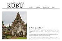
I then moved on to the 'about' page, where I wanted to incorporate an image of the Balinese temples to give the audience something to relate to when looking at the products. I selected these two photos that I used in my catalogue and I feel the second one is better suited as it fits nicer within the composition and I like the more neutral colours. This isn't a page that is normally included but I feel that it is important in this case as the designs have such a strong theme that the audience may not be aware of.
Next was to add the type and again I continued with a corresponding font. I started by looking at where the main title text could go but I found that it would be easier to add in the rest of the writing to see how it would all fi together. The final outcome has both paragraphs on top of each other, sat at the bottom of the frame to give space between the navigation which I think makes both aspects easier to read.
For my product menu I cut corresponding images into strips so that they fit equally within the frame. Again I used the cropping look so that the style of the website remained constant.
I felt that having all the images in colour was a bit to much so I desaturated everything and changed the design so that when a product was hovered over the colours would appear, I think this makes each aspect stand out a lot more. So that I could label each of the products I made the strips shorter so that there was space for type and then applied the colour aspect to each of them.
After selecting a style of product the user would then go through to the thumbnails which is what I have created next. I looked at where the title text could go and then incorporated black boxes to signify where the images would be. Initially I left a space on the left hand side so I could include filter menus, although I decided that because my product range isn't that extensive it would be unnecessary. I feel that the larger square boxes work the best as I think they will work well with all the items and the space underneath would be useful for information. After deciding the layout I added in the photographs and relevant type. I have also demonstrated how the page would scroll. I then applied this structure to the rest of the products.
I then moved on to create the page where the individual products could be viewed. I included multiple images to show the items in different ways, there is also a zoom option. There is also a design that demonstrates what it would look like when an item was added to the bag.
Finally here is the shopping bag with added products where the user can go through to the checkout and pay for their items.


No comments:
Post a Comment