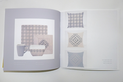
These are some photographs I have taken of my final printed catalogue and I am very pleased with the end result. Initially I thought the scale could have been a bit large but being able to hold and look at it now I think it fits well and links with a similar scale to current catalogues on the market. Although I think the square format will help it to stand out from the competition. The white and black cover is simplistic and slick and gives across the contemporary feel of the brand. The quality of the images is high and I think the large scale photographs work successfully. I am really happy with the fold out samples and how the cover has been incorporated to accommodate the increased composition. I would have liked to have really samples inside but because of time and cost limitations I stuck with using images, that I still think gets the point across.


No comments:
Post a Comment