Tuesday 29 November 2011

Frame and Format Photo Collection.

With our first workshop on Frame and Format where we looked at documenting the area around us following a certain theme, mine was the letter 'A'. Here are some photo's that I took to show this...

These were the images that were chosen as the most successful and interesting. A common theme that I have noticed through them is that none of them are actual type letters and the shape has been made by things in the environment. This is an idea that I would like to develop further.

The next workshop involved going out into Leeds and taking photo's following our theme. This was a lot more difficult than I expected, but this made it more rewarding when I did find a good shot. Here is a selection of some that I got...

Here are my chosen six that I would like to work with. I have tried to pick a variety of different styles...

Monday 28 November 2011

How To... Initial Ideas.

The first part of the workshop today was to take our problem research and compile twenty facts. Here is How to change gear smoothly top twenty facts...

  1. There is a set process for changing gears in a car: take foot off accelerator, put foot on clutch, change gear, swap peddles back.
  2. Always keep your eyes on the road.
  3. Simultaneous action.
  4. Let the gear shift pause as it crosses through neutral.
  5. Sometimes you will need to change to a lower gear for overtaking.
  6. Closely related to revs.
  7. Different people have different approaches to tackling it. For example, speed.
  8. Takes practice to master smoothly.
  9. Gears will need to be changed at different speeds.
  10. Different gears have different functions and qualities.
  11. Block changing is useful when changing gears. It is when you go through without stopping at each individual gear.
  12. Avoid 'snatching', changing gear with too much force.
  13. Low gears provide lots of acceleration.
  14. High gears provide speed.
  15. Releasing the clutch rapidly can result in rapid forward weight transfers.
  16. Releasing the clutch smoothly and moderating the throttle is essential to prevent wheel spin.
  17. Never change gear mid corner.
  18. In most vehicles the four gears form a 'H' appearance.
  19. The gear lever will automatically spring to neutral when not in gear.
  20. The sound of the engine will tell you when to change gear.
We then moved on to creating simple information graphics here is the first one I made using simple symbols to document moments of my life across a timeline...


After we moved on to taking our previous facts, choosing five and then portray them using a similar technique. I firstly drew it out by hand and then developed my design on Illustrator...

Saturday 26 November 2011

Colour Theory Continued.

To start this workshop we first looked at how colours react when placed on different surfaces. They are all the same pieces of paper but positioning them in different areas leads them to appear different. For example the middle photo looks the most pink as the grey background is bringing out the blue tones, whereas the far right looks more orange because of the more neutral paper its lying on.

The next two photo's are examples of simultaneous contrast. They show more directly how colour can be altered because of something it's paired with.


We then followed the same process again but added in a brighter tone of our initial colour. It was interesting because previously the other samples looked like an average tone but compared to the new look increasingly dull.


Next an alternate colour was added. I think the blue causes each tone of red to react differently, the darker appears more purple again as the blue tones are brought out. In contrast with the brighter variation which has been intensified because of the contrast. There is also another case of simultaneous contrast where the red crosses from the neutral through the blue.


I then looked at contrast of hue with adding the complimentary colour of red, green. I think this really brings out the colour, especially with the brighter tone.


Here is an experiment with all the samples of colour. I found with this that when the colours are separated it is harder to distinguish the difference. it isn't until the pieces are moved together that it becomes more obvious.


The next experiment was placing the colours or different surfaces, similarly to before. I found that on the neutral the colours appear warmer to the cool look on the white. The colours also look the most vibrant on the black paper.


Here are some further photo's exploring the difference of colour on black or white.


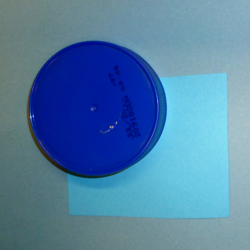
We then found items that represented the light and dark tones of our initial colour. I also gathered a blue object to see how it reacted with the paper.


Here are some type experiments, the aim was to look at how when using text in context the colours you choose can be very important in the impact it has on readability and the alteration of tones that appear. For example the black again makes the colours and especially the white more vibrant. These photo's also show how combing colours that are similar can cause the letter the fade away or become invisible.


This was the final part of the workshop where we combined the whole groups letters and ordered them from brightest to dullest on the black paper. If I was to do this again I would order them slightly differently with the bright red further down and perhaps the blue before the green. We then transferred this to a window to make an installation.


Friday 18 November 2011

Proverbally Yours Message and Delivery Feedback Response.

From my feedback it was suggested that I could develop the outer layer of my design, so I have gone back and reworked my initial idea...


With this image I decided to try and replicate my title text from the poster. Although I came to find that even though it worked successfully on a larger scale after it had been scaled down the appearance was not as attractive and the readability of the address, something very important for an envelope, has been compromised.


This is the most subtle of my changes and I think it is the one I like most. I like how the added lines link with the poster and carry on across the composition framing the address.


This is my final adaptation. I positioned the additional typography so it would fall across the fold. I did this so not all of the text would be visible to hopefully not distract from the address already there. I also think it is interesting viewing the tattoo design without the body.