Tuesday 28 February 2012

Communication Is A Virus Initial Ideas.


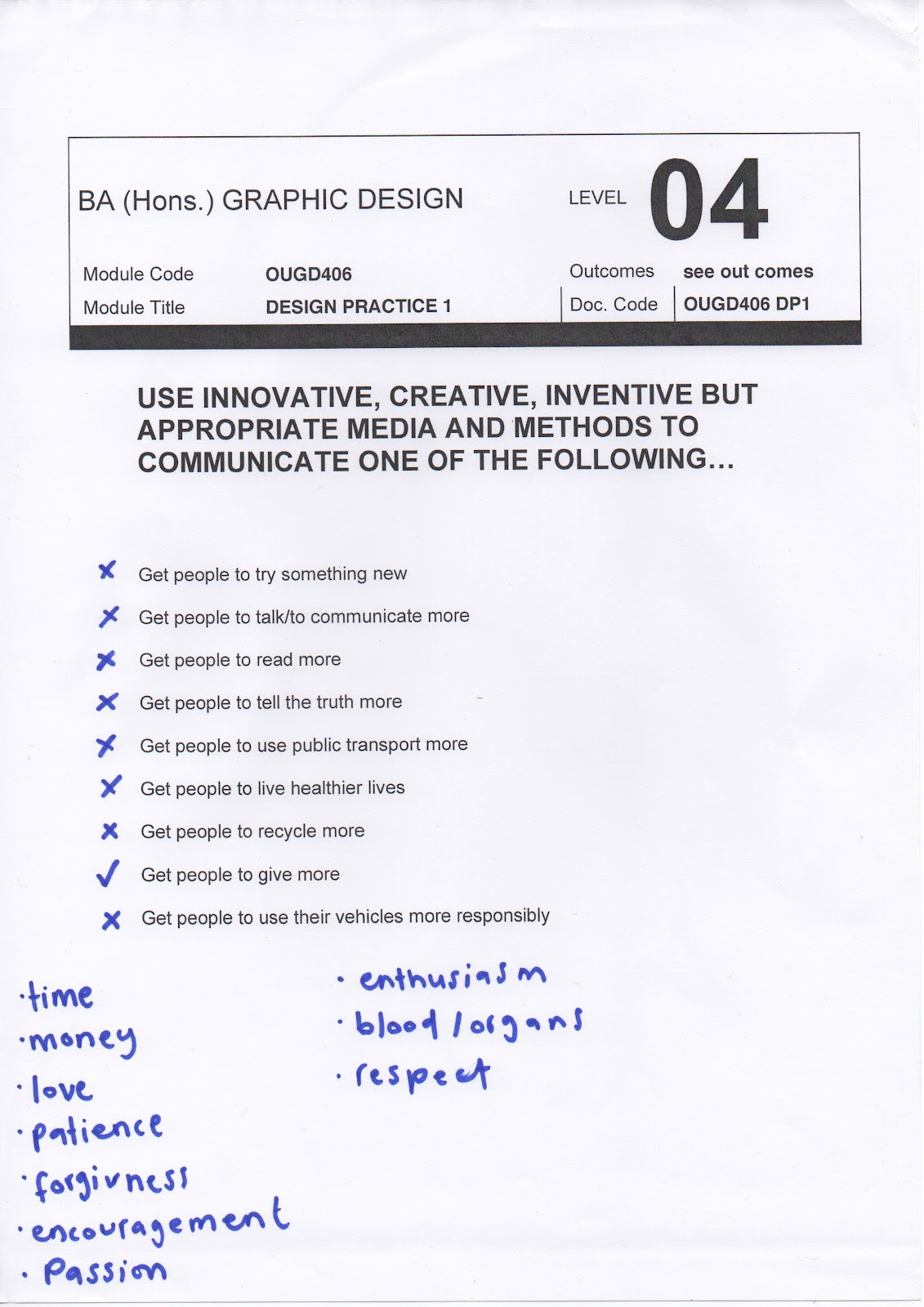
From our choice of 'get people to give more' we created this brainstorm to help with our idea development in deciding what route to go down. After collecting quite a few we circled the ones which we thought would be most appropriate. After a discussion we decided on 'smile' as it was a positive theme that would allow us to be humorous and fun.

We also considered our audience. Initially we were going to go down the student route as it would be an easy group for us to interact with, I wasn't overly happy about this but only because a lot of briefs I have done recently have been for them. After some thought though we decided that maybe students we already positive and that we should focus on people that are unhappy and where a smile could improve their mood. For example, people in boring or depressing office jobs.
We then made a list of products that would be suitable for this audience which were:
  • mugs
  • confectionary
  • tea/coffee cups
  • pens
  • stationary
  • desk tidies
  • calendar 
  • diary
  • post it notes
  • paper
  • sweets
  • laptop/computer
  • postage stamps
  • envelopes
  • USB drives
  • files
  • planners
  • index flags
  • notice boards
  • flip charts
  • labels
  • promotional products
  • personalised stationary

What Is A Line? Initial Ideas.

Initially I made some mind maps on lines and my favourite things. I found this a really helpful exercise for idea generation. Here are the ideas I gathered from it...

Types of line:
  • Stripes
  • Pin stripes
  • Stroke width
  • Telephone line
  • Zig-zag
  • Curly Ruler
  • Measurements
  • Graphs
  • Horizon
  • Thread
  • Conga line
  • Ants
  • Grid lines
  • Page line
  • Washing line
  • Cracks
  • Map Lines
  • Queue

Things I like:
  • Friends and family
  • Laughing
  • Design 
  • Music
  • Sun
  • Holidays
  • Nail varnish
  • Chocolate
  • Party time!!
  • Dancing
  • Shopping
  • Milk
  • Colour
  • Animals
  • My dog
  • High heels
  • Roast potatoes
  • Raspberries

I then combined my favourite ideas together along with some of my favourite projects from Design Principles so far to create a brief, some worked better than others.
I then picked my favourite and wrote my own brief.

The Poster Brief Crit Feedback.

I filled this in before the crit so I had some points of what to say beforehand. I found that this helped me when I was talking through my designs with group.

Here were suggestions from the group, I found them very helpful. I will definitely take their ideas on board when developing my designs.

Tuesday 21 February 2012

The Poster Brief Poster Creation.

This is the first poster that I started work on. I think the design is really powerful and has a lot of impact because of the repeat pattern. Initially the raindrops were too intense and I think they look a lot better after the opacity had been altered.

Next I made this to see what it would look like with a more minimalistic appearance, I don't think it is as successful as the one before as it is too bare. I think the varying opacity is interesting but also a bit distracting from the text.

Here is my third poster. Initially I started work with the grey raindrops but I felt that it was a bit dull. After replacing it with the blue I feel it looks better but still needs work on the composition in order to be successful. Even though I really like the concept so it could be developed further.

I love the simplicity of colour of this design, as I think it has a really classy appearance. The only thing I am considering is if it is too simple. I will develop this further to try and add more interest without compromising the high impact look it has now.

Raindrops have been added now to give another level to the design. I have also gone for a more monochrome colour scheme in this poster, I think it works well with the drops but the type has became slightly illegible.

A lot of development has gone on to get to this point. I started by adding an outer glow on the raindrops to help them stand out on the darker background. I also brought in the cloud which I think is a big improvement as it adds interest and balances out the composition. I finally added a block down the centre, finished with a gradient, to make the text more readable on the background. I am really happy with this design, I think it is my favourite so far.

This is my final design, I wanted to experiment with just text. I like how the different typeface accentuate some of the words. I added a gradient onto the background which helps to give the impression of falling rain.