I have taken on a few of my initial designs and pushed them further to help me to decide what to choose for my final posters.


I prefer this example a lot more now, I think the repetition has really helped it to appear as a raindrop. I tried a few variations on layout and I feel that the third is the weakest because it looks to in formation. I like the others and I think I will need to try them both in context to see what is most successful.


Here is another variation of the drop where I have removed the darker lines, I think this gives a cleaner appearance which is less bulky.


I felt that the original design of this could have been too grey, so I have experimented with adding colour and a different style of symbols. While working through this I liked the developed raindrops but I coolant get the music symbol to fit, I made it three dimensional which looked better but it still didn't sit comfortably. I then realised that it was too curved so I made it more edgy which I think is now successful.


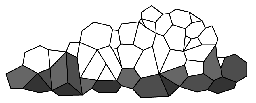


I have also created this geometric cloud to match my raindrop. I am really pleased with it's appearance and I think they will both look good together. I like how the light and dark tones have really exaggerated the form.
No comments:
Post a Comment