The Poster Brief
- Evaluate the problems that you identified and had to resolve within the brief.
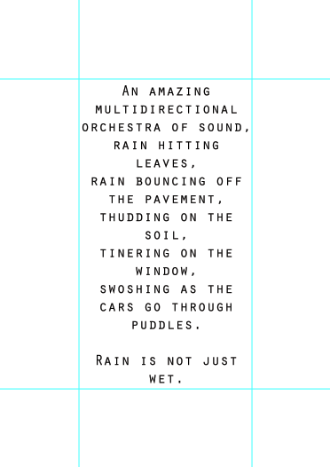
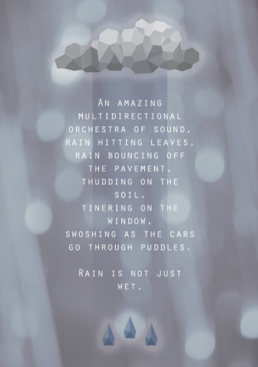
This was a live brief that was set by D&AD. We had to create a series of three poster that was focussed on the topic of English rain. The audience was tourists from other countries who we needed to inform on the positives of rain in Britain. It was stated that our outcomes should not be sarcastic.
- Evaluate the key considerations that you had to take into account when investigating this brief.
I felt the main consideration of this brief was the point of putting across rain in a positive view as in most cases especially to the people that live in Britain it is seen as an annoyance. I found it interesting looking into the reasons people enjoy in rather than the obvious point of that it helps things to grow.
- Evaluate the research activities that you had to undertake in order to resolve the brief.
To start I looked at previous work by Erik Kessel's who the brief was from in order to get a better understanding of what he was looking for. I also researched opinions from people and their positive views of rain to give me some inspiration on what to base my posters on. Finally I looked at pieces that already had rain as a focal point to help with imagery generation.
- Evaluate the examples of practical research that informed your resolution.
The main piece of research that inspired me the most was the quote I found of a blind man describing rain. I found it very poetic and emotive which I thought would be a great start for my designs.
- Evaluate the breadth of initial ideas that you generated in response to the brief.
For this brief I drew out a selection of smaller design sheets of imagery to gain inspiration and to develop further. I found this was successful but I could have pushed it further.
- Evaluate the breadth of visual investigation that you explored before deciding on your design direction.
I feel this part of my development was very strong. I had a large collection on digital experiments where quite a few got pushed even further. When composing my posters I also had a lot of variations that I could choose from.
Communication Is A Virus
- Evaluate the problems that you identified and had to resolve within the brief.
For this brief we had to select from a variety of options that revolved around 'getting people to...' The one our group chose was 'getting people to give more.' We then had to decide from this what route we were going to go on and we settled with getting people to smile more. The task was to communicate this idea to an audience.
- Evaluate the key considerations that you had to take into account when investigating this brief.
The main point we considered when doing this brief was how we were going to get our audience to interact with our products so the communicating of the message was successful.
- Evaluate the research activities that you had to undertake in order to resolve the brief.
To gather research for this project we looked a lot into what makes people smile and the benefits of it as we felt this would be very valuable information to include if we could convince people of the positives and could suggest a good outcome. In addition we looked at current examples of the products we were intending to create to gather some inspiration.
- Evaluate the examples of practical research that informed your resolution.
Some practical research we undertook was to actually visit the cafes we were planning on distributing our products in. This was very useful as it helped us to decide on the most fitting location. We also talked to customers after our pieces were in the environment to discuss the good points and whether they had an effect and were successful.
- Evaluate the breadth of initial ideas that you generated in response to the brief.
At the start of this project we made a very extensive mind map to choose the best route to follow. We came up with a lot of ideas and with the method of deselection we managed to find the best.
- Evaluate the breadth of visual investigation that you explored before deciding on your design direction.
I was personally involved in a lot of colour exploration which went through a lot of development in order to convey the best mood and the the best look with stock and supporting items. I also experimented a lot with composition when it came to the poster.
Stamp It
- Evaluate the problems that you identified and had to resolve within the brief.
The problem we had to overcome during this project was to highlight an environmental issue and put this information into the format of a stamp.
- Evaluate the key considerations that you had to take into account when investigating this brief.
I found the main consideration was the size of the stamp. Working on such a small scale isn't something I was familiar with so it took some thought to become accustomed with it. As it wasn't only the imagery that was smaller you had to find a way of conveying a message with a limited amount of space.
- Evaluate the research activities that you had to undertake in order to resolve the brief.
For this brief I researched into environmental issues focussing on water conservation and trying to find points I could develop. I also looked at current examples of environmental stamps to see how they faced the issue of putting across the theme.
- Evaluate the examples of practical research that informed your resolution.
I found the amount of written research I had selected hard to sort through so to make it easier I read through it and highlighted the areas of interest.
- Evaluate the breadth of initial ideas that you generated in response to the brief.
I have drawn a selection of deign sheets for this brief mostly looking at how to convey through imagery certain facts I had gathered. I then developed what I had done through my animal character design.
- Evaluate the breadth of visual investigation that you explored before deciding on your design direction.
When creating my stamps I visually investigated layout and composition thoroughly to ensure I had the best option.
Approach To Stamp It
Throughout my Stamp It brief this is how I would say I progressed through the project...
- Intuitive approach - Initial ideas based on own knowledge.
- Stimulated approach - Development of ideas through further research, books/internet etc.
- Systematic approach - Modification of components through design development.