Wednesday 12 December 2012

Goji Pattern Designs.

I have decided to go with my bird theme, so as an initial part of my pattern design I have drawn out these bird illustrations. I think this will be a good start in putting things together, although at the moment I'm unsure of how it will all go.


I then moved on to experimenting with colour, although I felt with the block colour it looked a bit intense, especially with the garish colours and with the pastel tones, a washed out effect. Because of how unsure I was with this style of applying colour I also looked into a more linear effect, although I'm still unconvinced with how effective this is also.


As I couldn't come up with a decision for the colour I carried on to focus with the overall layout of the design. I soon concluded that I would like other aspects incorporated into the composition like flowers to break up the layout slightly. I have carried on the tropical theme with the floral examples I have chosen and I soon settled with this linear style, I like how the pieces fit together but there is still development needed from this stage


I then moved on to experimenting with colour again. First of all by highlighting certain areas as suggested in my crit, I don't think the monochrome colours I used with this really did my design any justice though. I then moved onto to some more tropical tones, I was happier with the colour but I still felt the black outline didn't work that successfully. Next I continued with the colour theme but removed the background colour and the dark outline. I like the use of varying tones on the last example and the contrast of stroke thickness. 


I have applied my favoured colour design onto my larger pattern, I am very happy with the result but I still think it could be pushed further. As with the white areas of the illustrations and the background I feel there is too much white space.


Here is my final development. I feel the incorporated linear shapes really work well in breaking up the composition.

Tuesday 11 December 2012

ISTD Interim Crit.

My Feedback:


Action Plan:
  • re-consider/clarify audience
  • clarify ten topics
  • more design research
  • do some design work
  • have majority ready for next interim crit

Friday 7 December 2012

Typography Proverb Task.

Find a simple proverb and push the layout but ensure the proverb still read in the right order:

Thursday 6 December 2012

Responsive Competitive Submissions.

Submission guidelines

  • do you need to create an account/profile
  • download any submission details/forms
  • check mandatories/details
  • identify submission deadline
  • clarify submission process and formats
  • prepare submissions as directed
  • submit work

Product or proposal?
  • is the product essential to the concept?
  • product, range and distribution
  • putting work into context
  • mocking up to a high level
  • can use illustrations rather than photographs
  • do it ALL

Don't...
  • use bad language
  • include development work or variations that are unnecessary
  • take bad photographs
  • include to much information

Do...
  • start at the end, show the main piece first then explain the background information/mock ups
  • extend the brief

Responsive Workshop Three - Second Proposal.

New design boards:


Points I want feedback on:

  • do my design ideas fit with a female 18-25 target audience?
  • do my initial designs work as a pattern?
  • do you prefer the linear or block colour style?
  • what possible colours could I use?
  • how could I also target a male audience?

Feedback:
  • linear style is more popular but it was suggested to experiment with both as they will give very different looks
  • try block colour background with the linear style, maybe red/black/white to fit with the brand
  • bird design isn't to anti-masculine so I could just replace the flowers to fit a male audience
  • as the design is going it does fit with the female audience
  • experiment with highlighting specific aspects of the design with colour

Wednesday 5 December 2012

ISTD Concept Crit.

Rewritten brief:


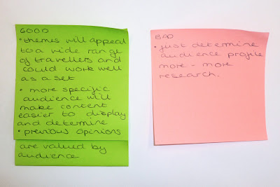
Feedback:


Five things I still don't know about my content:

  1. previous holiday goers opinions on different holiday experiences
  2. what ten holiday topics I will focus on
  3. further details about different holiday types
  4. cheapest and most expensive holiday options
  5. possible imagery I could use to illustrate my topics

Five ways my audience could come in contact with my work:
  1. travel agents - handouts/posters
  2. airports/coach stations/train stations
  3. online travel guide websites
  4. gift shops
  5. within travel brochures

Five new problems:
  1. what should I narrow down my audience to?
  2. how shall I gather opinions?
  3. what formats will work best?
  4. what style of imagery should I use?
  5. what holiday topics shall I focus on?

Five reasons they need to be solved:
  1. so I can be more specific in my design choices and create more successful products
  2. so I can have a primary research aspect to my projects and it will benefit my audience
  3. so I can target and interest my audience in the best way
  4. so I can illustrate my information in an engaging yet clear outcome
  5. so I can cover a broad range of topics and cover my audiences interests

Tuesday 4 December 2012

ISTD Initial Ideas.

Possible subject areas for travel:

  • camping - caravans and tents
  • back packing
  • inter-railing
  • cruises
  • package deals
  • luxury resorts
  • city breaks
  • holiday parks - pontins/butlins etc
  • ski resort
  • safari
  • b&b
  • coach tours
  • center parks
  • spa breaks
  • youth hostels
  • 18-30 resorts
  • mode of transport - aeroplane/ferry/car etc
  • price range

Format options:
  • book style publication
  • website
  • postcards
  • brochure style publication
  • leaflet
  • poster
  • app

ISTD Brief Analysis Workshop.


Chosen Brief: 10 Things you should know about


Five problems:
  1. unspecified audience
  2. wide range of categories
  3. no specified format
  4. publication and supporting material need to be created
  5. will have to do a lot of my own research

Five reasons why I want to solve them:
  1. I would like to target a specific group of people and tailor my design to suit them
  2. I would like to find a topic I can find interest in and get interesting ideas for outcomes
  3. layout etc is something I really want to develop and because it is open I can explore
  4. I would like to create a range of products
  5. I can develop my knowledge on a chosen topic

Five facts about your subject:
  1. inter-railing is one of the most popular ways to get around Europe
  2. holidays are often used as a time to relax
  3. back packing is very popular with students
  4. there are lots of caravan parks around the UK
  5. you can also travel via boat e.g cruises 

Five things I don't know:
  1. what are the most popular ways to travel?
  2. what are were holidays to 'butlins' etc most popular?
  3. who am I aiming this at?
  4. what other covers could I do... what are the topics?
  5. what format will work the best?

Five things about the audience:
  1. people looking for a new holiday experience
  2. people who are enthusiastic about travel
  3. people with the necessary funds to travel
  4. age from 16/17 +
  5. male and female

Five ideas I want to communicate:
  1. the different options of travel across the world/UK
  2. possible destinations
  3. different levels of holidays e.g from basic to five star
  4. prices for these different options
  5. opinions from people who have already done it

Five deliverables:
  1. book form publication
  2. corresponding website
  3. two linking additional covers
  4. poster
  5. set of information cards

Five points of distribution:
  1. travel agents
  2. airports
  3. railway/coach stations
  4. travel guide websites
  5. city self promotion websites

Sunday 2 December 2012

Design for Print Book Photographs.

Here is my completed Print Handbook that I have had printed through Issuu. I am really pleased with the quality of print and stock. I think it is great that I can now see my publication in context as you can get a feel for the size and format, that has worked great for my handbook idea. One thing that did crop up during printing was that I hadn't considered how the book would be binded, this has led to the centre margin being reduced. Thankfully none of the content has been lost and it is all still legible, just the layout has been slightly compromised. Overall I am extremely pleased with this end result and happy with the amount of information that has been included.

Saturday 1 December 2012

Design for Web Final Screen Shots.

These are the final screen shots for my completed 'To the Moon and Back' website. I am really surprised with how easily it has come together and how quickly I picked up the basic ropes from initially knowing nothing at all. I came up against a few problems along though, but they were easily sorted with some help.  I now feel confident that I could code a basic website similar to this again.
The overall design of my site has gone through a lot of development to ensure that the content and theme work cohesively together. Although the initial idea of having a circular content was quirky I believe that this works a lot more successfully in terms of readability and aesthetics.
I am really happy with the complete look and I think the illustrations work well and add more interest to the content. I think this also broadens the audience as it has the factual information and the illustrations add a fun twist for younger people. The site is also very interactive, regarding the facts and gallery pages. These were harder to create but I am pleased that I took the time as I think it has been beneficial.

Home


Facts


Gallery


Visit