Wednesday 28 November 2012

Design for Web Creating my Website.

  • creating basic web page


  • creating basic css


  • linking stylesheet.css to index.html 


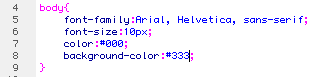
  • specifying font size and colour

  • creating page boundaries and navigation, centring and linking with index.html
 

  • creating columns, linking and positioning
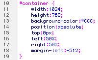


  • centring container

Preview


  • separating navigation with rows and columns and adding rollover links

  • adding title image

  • changing content layout for facts.html


  • changing background colour

  • removing other background colours

  • adding background image

  • adding Lightbox code and images with thumbnails to gallery.html and creating css to tell them where to be placed

  • creating rows and columns for facts.html navigation

  • adding addition .html pages for the 'facts' section

  • adding rollover buttons

  • centring buttons

  • adding images to 'facts' pages


  • adding content to index.html

Tuesday 27 November 2012

Design for Web Final Developments.

As response from my crit feedback I have decided to re-work my designs again. They have already been through some development but I think the process has been really beneficial to the progress of my work. I have removed my circular frame and replaced it with a semi-circle shape. This still follows the moon theme but I think the content will fit a lot more successfully within this space. I have still incorporated the circles for my gallery and some navigation as it works better in the space than a more angular option. I have also developed my logo design as I think it looks more clean and less distracting.


Scamp


Wire-frame


Digital page mockups


Design for Web Final Crit.

My Feedback:


I found this feedback very helpful as I already, personally wasn't 100% convinced with these designs. Especially with the circular layout and fitting the content inside of this whilst still keeping a consistant and visually pleasing look. I have decided to stick with a circular idea as it has been taken well and links strongly with my theme, although I think I will develop it so that the content fits better and there isn't such a strong contrast with the square and round edges. I will also experiment with using different type, as it has been said that what I have now isn't necessarily relevant to my topic. I was quite surprised when one group didn't write any areas of improvement as I could name a few myself. I think it would have been more helpful to me if they had done so, even if it is quite flattering to see.


Action plan:

  • experiment with different type - make more relevant to my topic
  • develop layout - fit better with content, new scamp and wire frame


Common group feedback:

  • simplify navigation - homepage to home etc.
  • content - to much information, to long... didn't read it
  • consistency of layout
  • clarity
  • complacent feedback, be more specific

Monday 26 November 2012

Design for Web Developed Designs.

After my initial crit is was suggested that I should progress with my circular design. I have developed it slightly to make the navigation clearer and I have also created a wire frame and digital mock-ups. Initially I was very happy with the theory of this design but as I looked at the mock-ups I'm unsure whether the content fits successfully within the circular frame and I don't like the contrast between the smooth curves and sharp angles. Also because the space is so small scroll bars have been included which I don't think does the content justice. I will take these to my crit and see what other people have to say, which will help me move forward.


Scamp


Wire-frame


Digital page mockups