Creating my zines was a very slow process as there were so many aspects to consider. It was also my first attempt at using InDesign so setting out my document in the beginning took a while.
I started by creating my front page and choosing a texture from a website to apply to the surface. I experimented with a few different ones and also over laying colour to create a brighter appearance.
Type was the next area of experimentation, I looked at a selection all of a handwritten style to fit with my notebook theme. My favourites were Mari&David because of it's narrow appearance in capital letters and ActionJackson with it's 3D effect. Some I found that when I converted them to white they became illegible.
After deciding my chosen typefaces I experimented with layout and colour. I think the darker burnt orange works well and compliments the background well.
Next I drew some lines to help frame the composition. I used the grid to ensure everything was central and in line. I also looked at opacity so that they didn't overpower the type.
I then moved onto adding the imagery I had created. I continued to use the grid and explored different sizes, positions and opacities before settling with the final look.
The last aspect of the front cover was the sample of tape, which I think really finishes off the design and assists they eye in travelling across the composition.
Next I furthered the process to my inside pages where I decided on a lighter background and started inserting and experimented with my wording for the introduction page. I decided on just using one of the typefaces as I thought that with the larger amount of words using the both was too overpowering and I couldn't find a good balance. I looked at different colours and using colour to highlight important pieces of information from the text to draw the readers attention.
I then added in my imagery, because of the loss of quality in the editing stages of InDesign it's quite off putting when you look at them because I worried about how they would print but it's just something I got used to through the process. One thing I looked at was adding a text wrap to make the text not overlap with the picture, this was a very useful and time consuming action. Opacity was something I altered again to ensure it wasn't overpowering.
Finally I added the lines like the ones on the cover to create constancy and to define the edges of the composition.
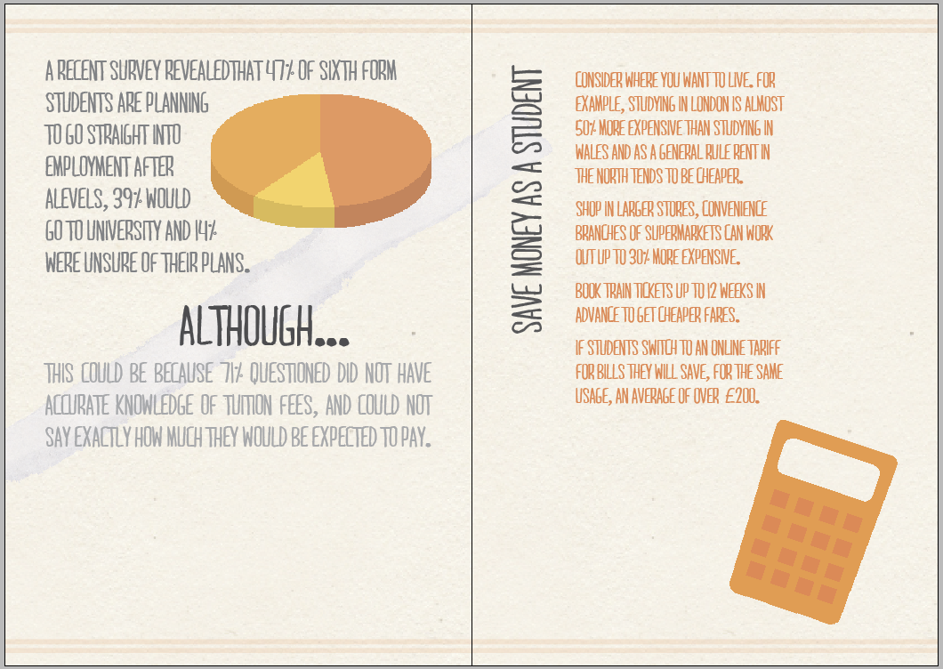
Next to do was the main content page of the publication. I went through similar processes to create this, of using the grid to align the different aspects. It was quite tricky laying out all of the information because there was so much of it to include but when I found balance by weighting the page and considering font size and colour, imagery and added aspects.
I then carried on with my final page. I decided to keep one of the sides blank so it mirrored the first page.


No comments:
Post a Comment