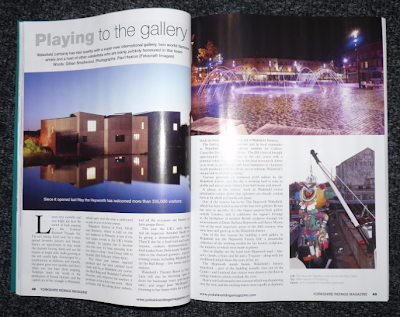
Here is the magazine spread that I have decided to re-design from '...' I chose it because it has a good selection of type hierarchies and imagery.
I then drew on the magazine to decide my grid and translated onto InDesign.
I then used a minimised version of my grid to design some alternate layouts by using the aspects of the original piece. To start with I thought it would be difficult to create so many variations but as I got going ideas flowed easier than I thought.
Here is the chosen design I have decided to recreate. I have chosen this because I feel the linear style will work well and look effective.
I then moved on to creating my chosen thumbnail on InDesign, I started by creating my grid and adding boxes to represent the main aspects of the composition.
Next I scanned in the original images from the magazine and placed them into the boxes I had previously made. I then added the coloured boxes that I had drawn in my design, although I soon found that the colour I had chose to start with didn't fit as well with the photographs so I changed them to a bluey grey.
I then experimented with type. I soon found out that picking one that would work would be harder than I expected as the handwritten style I had originally drawn did not fit into the chosen area when I used a typeface. So I decided on a simplistic sans serif option that I think fits better with the style of the spread. I also altered the colours further to create a more balanced look.
This is my final composition and I am happy with it. Although some aesthetic options have been changed around the main layout has remained the same from my design and looks effective.


No comments:
Post a Comment