I wanted to make my point of sale signs to be individual to each of my bottle designs. I started by drawing out a template to apply my design onto. I really liked the structure of this option as I thought it would really help to make the product stand out. I drew two angles so that when I submitted my work, whoever was viewing would have a clearer idea.


I started by blocking in basic colours and adding my bottles to help the structure come to life. I felt an interesting effect, better than a plain colour would be to add my pattern onto the background. I lowered the opacity so the look was more subtle and would help the bottles stand out. I experimented with the two main colours and felt that the pink worked better aesthetically. I also added a shadow to the bottle to give a three dimensional look.


I then started incorporating other design aspects to advertise the fragrance more clearly. I felt that the berry illustration would be key in getting across the feel of the product so I experimented with it a lot in different sizes and sequences. After deciding that this would be a focal point I altered the pink to grey as it made the berry a lot more prominent and the neutral colour made it seem more vibrant. I also experimented with type using the font from the bottle and the Batiste logo and I soon came to realise that with multiple images and the text the composition became to busy and detracted from the bottles. I then stripped back the design to one shape and the batiste logo. I felt the scent text was unnecessary because the berry could get across that point on its own.


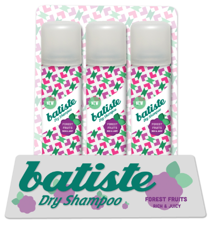


I am very happy with this final outcome as I think it successfully highlights the product. After finishing this design I applied it to the other angle where it works just as well. I then moved on to the fragrances using this one as a template so they all still worked as a set.


No comments:
Post a Comment