After looking through my possible sent ideas I have tried to link them with the geometric patterns I have created.
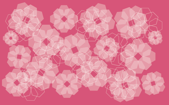
Orange Blossom

I felt that this shape had a very floral theme and therefore fitted well with the blossom look. I experimented with a few tones of orange and also used opacity to give a delicate feel.

I then looked at composition and how I could apply the shape to get a successful pattern. I experimented with having the flower as separate shapes which I felt looked to placed and unnatural and also overlapping which was to crowded and the shapes were lost within each other. Although when I combined these two ideas together and also varied the size and angle it work a lot more successfully.


To add depth to the pattern I then introduced a linear aspect of contrasting colours which I liked but felt was slightly overpowering, so I toned down the colour to a darker orange shade that was a lot more complimentary.


Next I experimented with background colours which started again as bright contrasting tones. From the pink and orange I looked at changing the floral aspect to white, as it looked more sophisticated and also had a better link with original orange blossom image. Which is when the background became orange to link with the chosen scent.


Tutti Frutti

I picked this particular pattern for tutti fruity as because it is made up of a selection of fruits it would be hard to represent them all, whereas this structure is a neutral representation of them all, using colour to make the link. This pattern needed little development apart from lowering the opacity to make the colours more girly and less garish.


Fruits of the Forest

I made the link between this pattern and forest fruits as I made a link with the structure of leaves surrounding a berry or vice versa. Therefore it was easy to apply the colour and have the image come together. I feel the pink version is stronger as it will appeal more to the target audience.


Honeycomb

I found that these heptagonal shapes had a very strong link with honeycomb, even how the shapes can be placed together to create a strong structure. I found it hard to get an attractive colour palette for this design as the appropriate bright yellows and oranges seemed to garish. Although with some further experimentation I found that overlaying another image with a low transparency not only made the colour more appealing but also made the structure a lot more interesting. This was continued by adding the white linear layer.


No comments:
Post a Comment