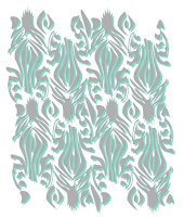
I have decided to experiment with adding some colour to my patterns to lift it from black and white. I started off with quite bold, bright tones and then changed it slightly to more greys and pastels as I felt it looked more aesthetically attractive. I played around with the lightness of each to ensure I got the right balance. For my final design I added an additional level of colour which finishes it off well.
I then moved on to the tiger design where I started off using an alternative colour to what usually would be associated, although after looking at it I decided to stick with the common link that is orange. With this pattern I also played around with stroke thickness in order to have the right amount of each tone showing from behind the main line.
I then continued the process with my other designs keeping as well as I could with colours they would be associated with to carry on the theme. I also kept the tones in pastel shades so that when I incorporate all the imagery into the book there will be continuity across the pages which will make a fluid viewing for the audience.


No comments:
Post a Comment