I have started to experiment with developing my pattern designs into digital versions. I found that the process was speeded up greatly because I had already experimented with my my hand drawn illustrations and had the shapes and patterns ready to translate. Once I had got the initial image I found it was a lot easier to experiment with scale, colour and composition than it would have been if I had carried on by hand.
I started off with one of my designs that I felt was most successful as it represented the initial image most successfully, I altered it slightly as well to give some variation to the pattern. I like the three structures standing upright as I think it works well in representing the temples. Although I feel that the slightly triangular shape really lends itself to being alternated and fitting together in a jigsaw style.


I then moved on to look at colour using the colour palette that linked with the corresponding image. I experimented with a variety of different variations to see what was the most successful. I felt that the options where both lines were the same colour worked the best as it gave a cleaner overall look.


I then applied the colour options to my decided layout, combing a selection of colours from the palette. I like how the colours work together as I feel they compliment well, I think this has helped by choosing tones from the original photographic image. I also looked at adding a background colour to give the illustrations more depth and to move onto the transition of creating a wallpaper.


For further development I experimented with increasing the surface area of my shapes to create a more extensive pattern. I like how the lines of shapes interact with each other to create the zig-zagged separation. I picked the two colours that attracted me the most and alternated how they would appear within the composition. With the varied line option I like how this has accentuated the pattern between the strips but on the other I think how the stripes are so clear works well.


I then looked at possible colours, first of all focussing on these green tones. I preferred the lime colour the best although I felt that it was less visible, which led me to incorporate the two and use the darker colour underneath to enhance it. After discovering that this worked a lot better I then looked at other possible colours from the colour scheme that I could use. I think the red and orange work well and the doubling up of the colour looks really effective. I finally experimented with adding a neutral background to help the shapes stand out even further.


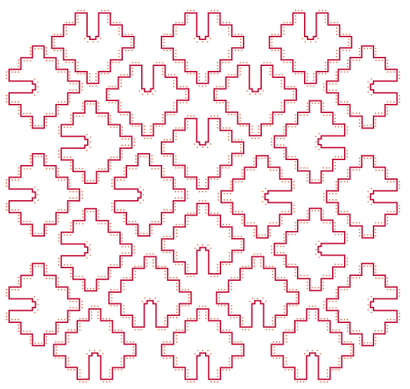
My next shape is a lot simpler, but I feel the dotted aspect helps to add interest. The diamond shape was quite adaptable when creating the composition as the angles fitted well together, the shapes could also be rotated and still fit easily within the space. I think the different angles working together gives a really interesting appearance.


For this pattern I wanted to keep the main bulk of the pattern the same colour as to differentiate it and make it even more different from the rest of the designs. To develop the composition further I took the dotted layer and duplicated it a few times and arranged them in different areas of the patten. I think this has been very successful as it adds a delicate feel and an added interest. I made these a lighter colour so that they were slightly more subtle.


Finally I created this more decorative shape, it took a while to draw out as I used a grid to ensure that it was totally symmetrical. I like the variation in stroke width as I think it is interesting how different aspects are highlighted. Because of the long shape it was harder to find more creative ways of laying out the composition and because of the detail within the shape if they are laid out to close together it can look cluttered.


Because this shape has quite a lot of aspects there was a lot of experimentation when applying colour as a wide variety of tones could be applied. I feel the orange ones wok the best as i think it replicates the original architecture really well.


No comments:
Post a Comment