I have decided to continue with my compass design idea as I think it is the most visually striking and effective idea. After making this decision I wrote out a whole alphabet to get an initial understanding of how the other letter in the alphabet would work on my grid. Here is the results...

After doing this I was really happy with the end result and it backed up my choice of design. Although I really liked it I also wanted to experiment with a few developments of using the compass grid in alternative ways...
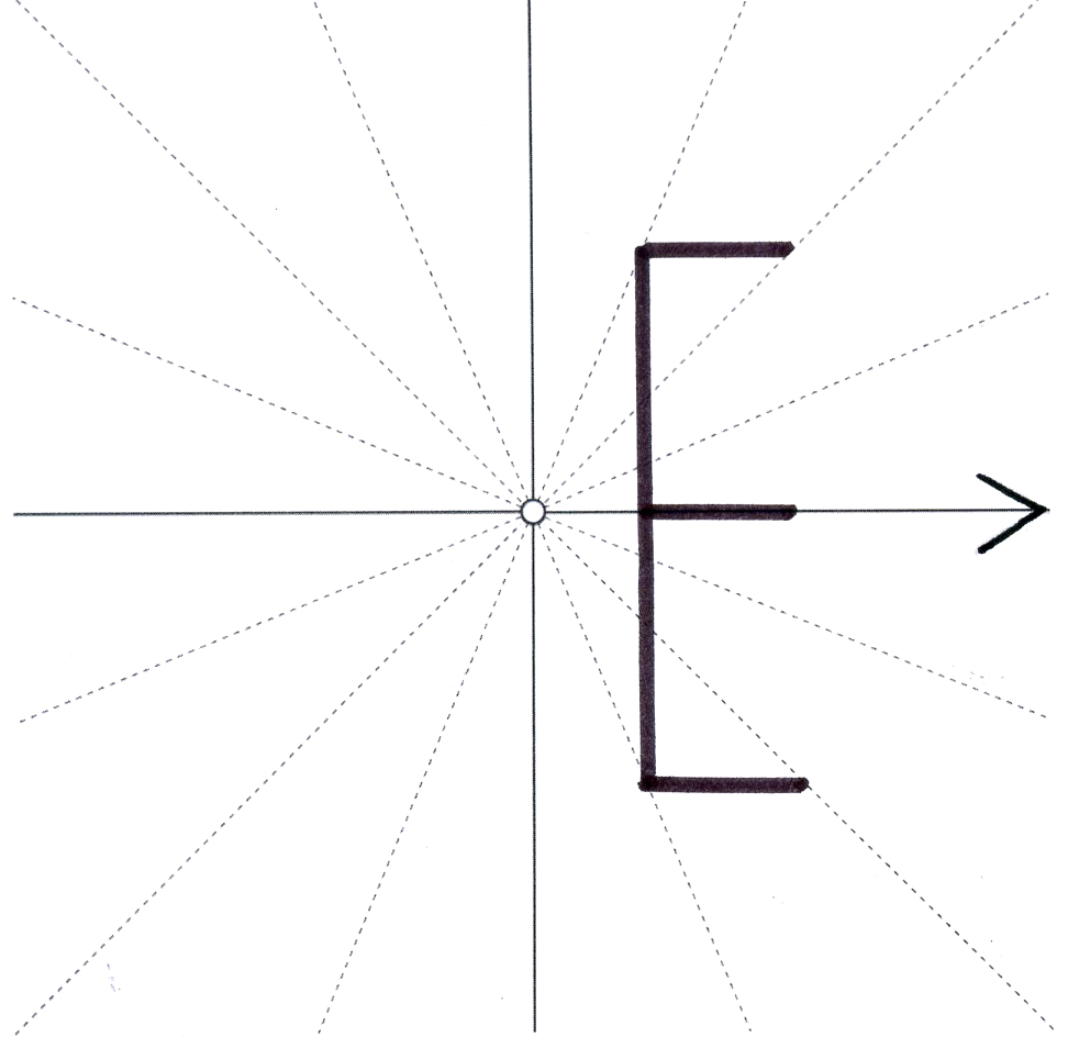


With these letter E's I really focused on portraying the direction of east, with the use of arrows and the placement of them on the grid. I prefer the designs where the letters are placed on the centre line rather than alongside it.


With these K's the idea of experimentation was more with the direction of line and how far it could be pushed before it became less legible. I think the first two are acceptable but the third has maybe been pushed to far and looks readable and attractive.


I think these letter M's have the most variation in experimentation. It was interesting constructing the letters with the strict boundaries of the grid. A you can tell from the top two images there is a big contrast in both letters structures that can't be altered. I like the shape of the third M but I don't like how it only uses half of the composition. Also through the E's and K's as well I have looked at incorporating arrows into the design I like this look but I feel it could be overpowering included into the whole set.
No comments:
Post a Comment