
This was my first colour experimentation, I chose red as it is a colour that is instantly associated with love, hearts etc. Although I think this would be a suitable colour I also think that it could also be a bit predictable.

I next looked at blue because of it's links with sadness which could be portrayed through the two charters being apart. I chose this light tone as it works well with the white without having to much contrast and being to overpowering. Although this colour is less obvious than the red I don't think it helps to create the right mood and doesn't work as well with the heart imagery.
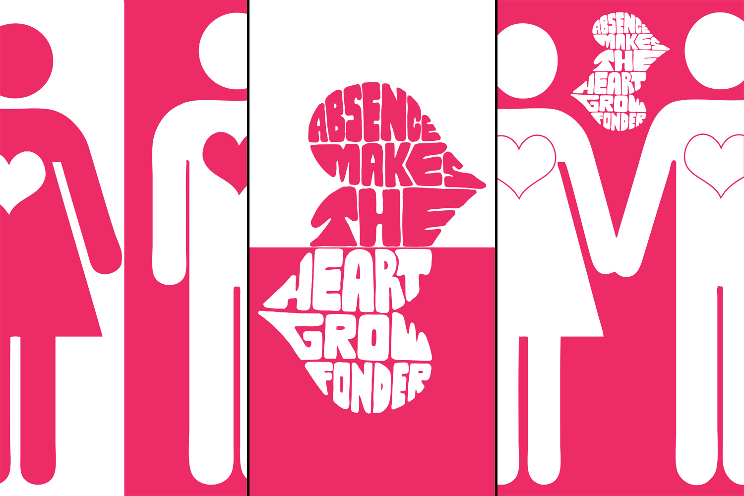
I then looked at this pinker tone. I think this is a really attractive colour that looks good and helps with the theme. It has quite a feminine look but I don't think this is a problem.

I then experimented with using black instead of white. I like the impact this has created but I prefer the lighter appearance of the white which I think will give more relevant connotations of positivity.
No comments:
Post a Comment