I have started my initial logo designs. I began the process by doing quick sketches of travel luggage, where I then moved on to simplifying these drawings so they would be more successful within a logo.


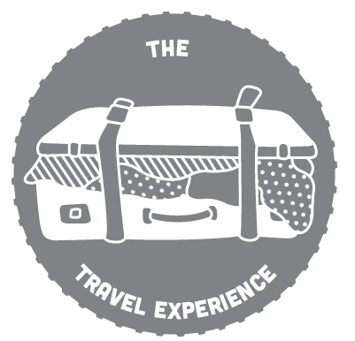
I then picked my favourite which was the overflowing suitcase as I think it had a more comical look that I thought would suit the young target audience. I took it into Illustrator and drew it digitally and developed the linear style to have a more comic book feel. I liked this and I think it separated the items well.


I then worked on applying my image into the logo. I started by incorporating a photographic image to link with the rest of my designs. Although I liked how parts showed through the spaces I think the overall effect was too busy and distracting.


I then moved on to a block colour background where I think my image is a lot more legible. I experimented with placing the type in different areas to see what would be the most successful. I liked the curved line at the bottom of the circle but this meant the type would be quite small and therefore hard to read. I decided on the overlapping line as I like how the type changed colour as it was an interesting effect.


Finally after deciding on my chosen logo I experimented with different colour choices. I feel that the grey works best, but the other colours could be used to represent different holiday experiences.

No comments:
Post a Comment