Sunday, 4 March 2012

Communication Is A Virus Coffee Sleeve Experiments.

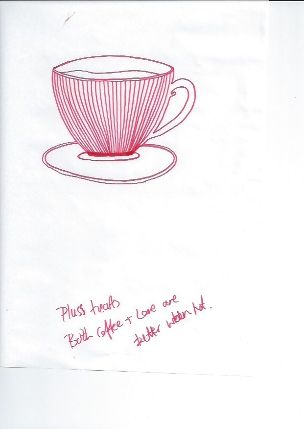
Today I started work on creating the designs for our coffee sleeves. I started by creating the lines from the drawings and then sending it to Beth so she could add the colour. I think the development through is good and I like how the quality of the sketch has been retained.

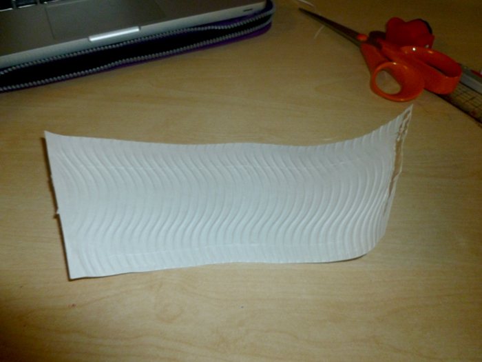
I then took my template and arranged the imagery inside. I am really happy with the choice of adding the circular protrusion as it fits well. There was slight confusion with what was correct for the two colour constriction, but we decided that ours would be fine as it was the same colour just at different levels of opacity. I added a border which frames the composition well.

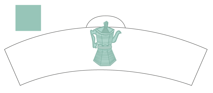
Text experimentation was next, I sampled a few and as a group we decided that we preferred the uppercase options better. The final choice was 'Mench', I like the thin stroke width and linear appearance as I think those qualities work well with the illustrations.


As a final alteration I removed some of the lines from the image as when I shrunk it down it became cramped and to dark. 


Communication Is A Virus Creating Template.

I have decided to create my own template for our sleeve, as the one I got from the internet did not fit our cup correctly. At first I wasn't sure how to go about it as I didn't know how to calcite the exact curves. I found out that outer layer peeled off which was a good starting point.

I then took my scan over to Illustrator and traced the outline. I didn't want our sleeve to be as tall so I edited it to be smaller while still retaining the original form.

After printing it off I was pleased to find that it fit correctly. Around the back it was slightly wonky but I think this was because of my incorrect cutting.

To develop it further I tried to add an additional shape to the outline to add an interesting look. I used guides to help get it central and I also had to consider the height of the ark so it didn't protrude or come to close to the top of the cup.

I think this template has worked really successfully and adds another level to the design. At a later date I may develop it further to work with other aspects of the composition.

Communication Is A Virus Initial Drawings.

These are some initial drawings by Katie and Emily, I really like them and I think they fit well with the quotes that we've chosen. I really like the linear style and I hope that this can be recreated when we digitalise them.


The Poster Brief Final Development.

Initially I altered some spellings within the piece, as when I got the quote I just assumed it would be correct when it wasn't. I also changed the opacity of the background in order to make it less powerful and therefore simplify the appearance slightly.

It was also suggested that I use a lower case typeface to make a more subtle and delicate appearance. I have experiment with quite a few and I don't feel any of them are as successful as the original one I chose. I like the uniform appearance the uppercase style brings so I think I'm going to stick with it.

Another point mentioned during the crit was to look into the repetition of my cloud imagery as it was popular within the group.nI experimented with a few different options but I think it makes the composition look too cluttered and I prefer the more simplistic appearance.

I finally messed around with different opacities, as I thought that rather than repeating the cloud if I made it bolder it would stand out more anyway. I am happy with this last outcome and I think that the amount of development I've gone through has been beneficial.

Friday, 2 March 2012

Communication Is A Virus Sleeve Experiments.


Communication Is A Virus Interim Crit.

Today we had a crit and presentation with Amber and another group. I feel it went really well and we presented our ideas successfully. From this it was stated that we needed to consider how we would get our products out to the public and how we would measure their success. We talked about this and came to the conclusion of making our coffee cup sleeves to be used in cafes in the area for one day. After deciding this we went out into the area and pitched our ideas to the local businesses, we chose two which we thought we would be the most fitting and arranged with them when we would be ready. They are also close together so it will be easy to go between them and measure the reactions. I am really looking forward to seeing the results.